
Which Pairs Move Most on CPI Day
US CPI is a dollar event, not an inflation event. That single fact decides the whole ranking — which instruments deliver real range, which only look like they do, and why the first 30 minutes and the full session produce two different tables.
Most CPI-day advice tells you how to trade the release. Almost none of it tells you what to trade, which is strange, because the instrument choice decides more of your outcome than the entry technique does. Two traders with identical reads on the same print will end the day with completely different results if one is in EUR/GBP and the other is in USD/JPY.
This post is only about that choice. It is a ranking, with the reasoning behind each position, and a set of selection rules at the end. If you want the execution side — how to read the surprise against the forecast, when fading works and when it does not, how a break-and-retest behaves on news — that lives in our guide to trading NFP, CPI and FOMC, and the wider question of which events are worth showing up for at all is covered in high-impact forex news events. This one assumes you have already decided to be at the desk at 8:30 a.m. Eastern.
The organising idea is one sentence long: US CPI is a repricing of the dollar, so instruments containing a dollar leg get the whole shock and instruments that do not get a residual. Everything in the table below follows from that, plus two modifiers — rate sensitivity, and how much the risk regime piles on afterwards.
Key Takeaways
- →US CPI is a dollar event. USD-quoted pairs take the direct hit; non-USD crosses only get the difference between two legs, which is small.
- →USD/JPY is consistently the widest pure-FX mover, because the yen carries the largest rate-differential sensitivity in the G10.
- →Gold travels furthest but trades real yields, not the headline — which is why it sometimes rallies on a hot print and looks broken.
- →EUR/USD is rarely the biggest mover and is usually the best trade anyway, because it gives the most range per unit of spread.
- →The first 30 minutes and the full session produce different rankings. Pick the instrument that suits the window you actually intend to hold.
- →Trading EUR/USD, GBP/USD and AUD/USD together on CPI is not diversification. It is one dollar position in three costumes.
1. Why CPI is a dollar event, not an inflation event
The Consumer Price Index is published by the US Bureau of Labor Statistics, monthly, at 8:30 a.m. Eastern Time, on dates fixed a year in advance in the BLS release schedule. Nothing about that description explains why FX moves.
The BLS explaining its own index construction. Worth four minutes purely to see how little of it has anything to do with currencies — which is the point of this section.
Here is the part that does. CPI is not even the Federal Reserve’s target measure — the Committee’s 2 percent longer-run inflation goal is defined on PCE, not CPI. The market still trades CPI harder than PCE for a simple reason: it comes out first, it is the earliest hard read on the inflation month, and most of the PCE components can be backed out of it. CPI is the leak in the dam. By the time PCE arrives, the repricing has already happened.
So what actually moves is not “inflation”. It is the market’s expected path of the fed funds rate. A hot print pulls the expected path higher, which lifts short-dated Treasury yields, which makes holding dollars pay more, which bids the dollar. A cool print does the reverse. That is the entire transmission mechanism, and it explains why the level of inflation is irrelevant and only the surprise against the forecast matters — the level is already in the price.
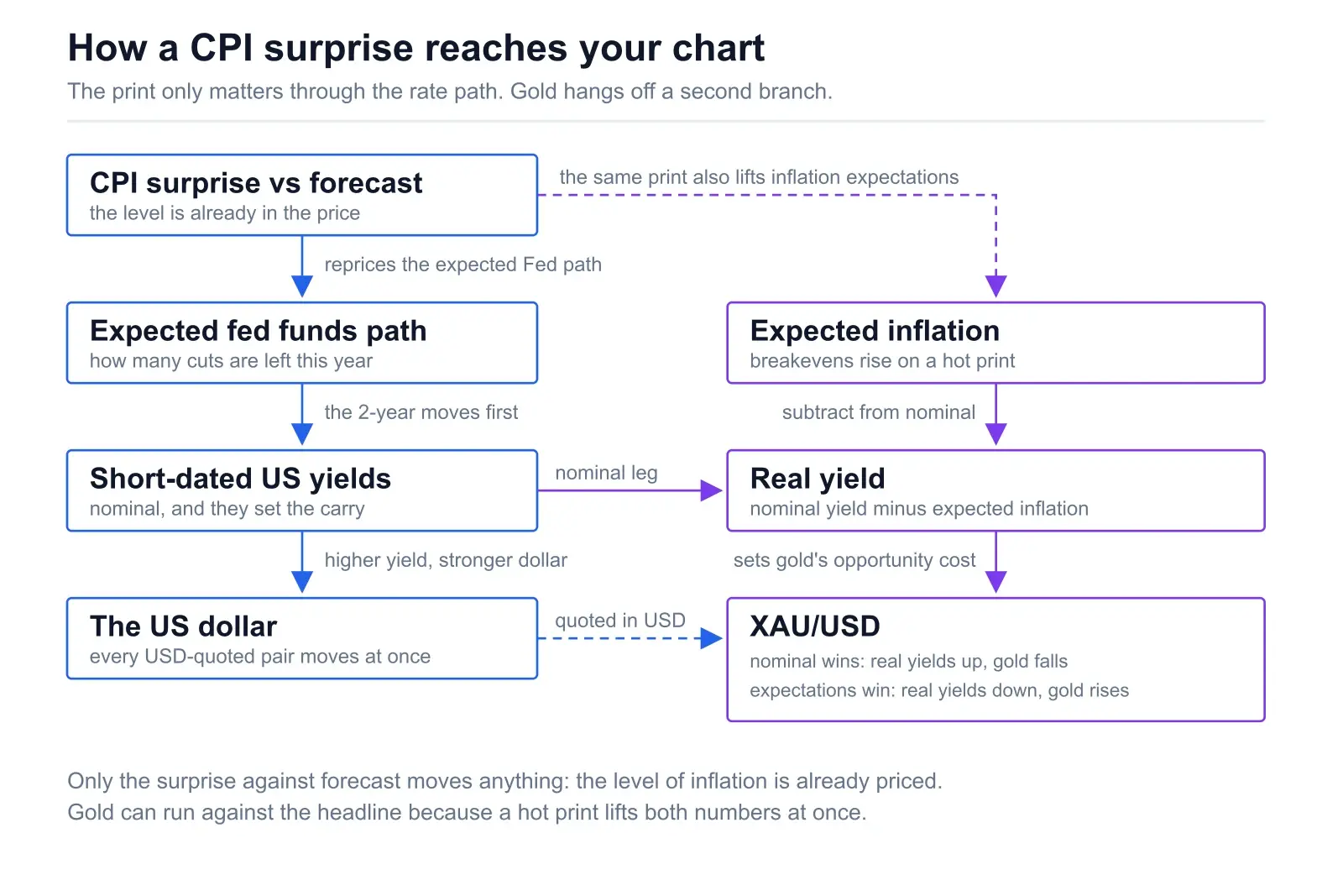
The consequence for pair selection. If the shock is applied to the dollar, then an instrument’s CPI-day range is roughly: how big the dollar move is × how much of that instrument is a dollar bet × how rate-sensitive the other leg is. EUR/USD is 100% dollar bet. EUR/GBP is close to 0%. That ratio, not chart pattern quality or personal preference, is what sorts the table.
The two modifiers
Two things distort the simple version. The first is rate-differential sensitivity: currencies whose central banks sit far from the Fed on the policy curve reprice more per basis point of US yield change. The yen is the extreme case and the Swiss franc is close behind. The second is the risk regime: a hot CPI does not only bid the dollar, it also knocks equities, and currencies with an equity beta take a second hit in the same direction. The Australian dollar gets both. The Canadian dollar, oddly, gets almost neither.
Everything below is those three factors applied instrument by instrument.
2. The ranking: full CPI session
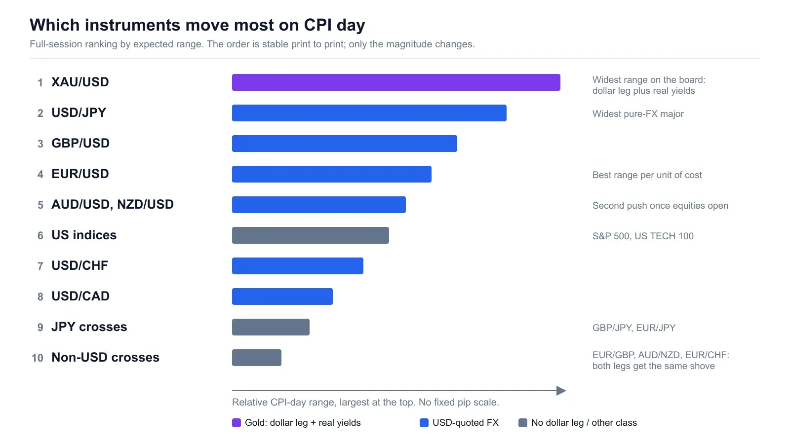
This is the order for the whole session — from the release through the New York cash open and into the afternoon. It is a relative ranking, not a promise about pips. The magnitude changes enormously depending on how big the surprise is; what stays stable is the order.
| # | Instrument | Why it ranks here | Cost & cleanliness |
|---|---|---|---|
| 1 | XAU/USD | Largest absolute range of anything on the board. Two channels at once: the dollar leg, and real yields via inflation expectations. Also the least directionally predictable. | Spread widens hard and stays wide longest. Whippy. Big range, dirty range. |
| 2 | USD/JPY | Widest of the pure-FX majors. The largest rate-differential sensitivity in the G10, and CPI is a rate-path event by definition. | Good liquidity, moderate widening. The cleanest of the big movers. Intervention risk is the caveat. |
| 3 | GBP/USD | Higher beta than EUR/USD on the same dollar shock. Sterling is a thinner book that overshoots and then partially retraces. | Spread roughly double EUR/USD in calm, worse in the spike. Extra range is partly eaten by extra cost. |
| 4 | EUR/USD | Pure, undiluted dollar expression. Rarely the biggest mover in absolute pips, and the benchmark everything else is measured against. | Best in class. Deepest book, tightest spread, smallest proportional widening. Best range per unit of cost. |
| 5 | AUD/USD, NZD/USD | Rate move plus a risk-regime kick. When a hot print sells equities, the commodity dollars are hit twice in the same direction, so session range often exceeds the first-30-minute range. | Small pip value, wider relative spread, and thinner books outside their own session. NZD noticeably worse than AUD. |
| 6 | US indices (S&P 500, US TECH 100) | React violently, but on their own clock. The futures move at 8:30; the real repricing happens at the 9:30 cash open, which is a second, separate event. | Two-stage move makes stop placement awkward. Different instrument class, different risk profile. |
| 7 | USD/CHF | Rate-sensitive like the yen but pulled the other way by safe-haven flow, so the two channels partially cancel. Mid-table by construction. | Decent liquidity, wider spread than EUR/USD. Reads as a muddier EUR/USD most of the time. |
| 8 | USD/CAD | The dampener. CAD is the G10 currency most correlated with USD in broad dollar moves, so when the dollar rallies against everything, CAD falls least and this pair travels least. | Fine liquidity. Smallest range of the USD majors — useful if you want a smaller stop, useless if you came for volatility. |
| 9 | JPY crosses (GBP/JPY, EUR/JPY) | Can produce enormous range, but only when the risk channel dominates — and they contain no dollar leg, so on a clean rate-only print they can go almost nowhere. | Wide spreads, violent wicks, worst slippage on the board. High variance in every sense. |
| 10 | EUR/GBP, AUD/NZD, EUR/CHF | Both legs receive the same dollar shove, so it cancels. What remains is the residual difference in each leg’s sensitivity, which is second-order and small. | Wider spread, less range. Worst cost-to-range ratio on the board. Genuinely the wrong instrument. |
Two honest caveats about this table. First, it is a ranking by expected range, and any single print can scramble it — a CPI that lands exactly on forecast can produce a session where nothing moves anywhere and the entire exercise is moot. Second, the top of the table is not the best place to trade. It is the loudest. Those are different things, and the rest of this post is largely about the gap between them.
3. The first 30 minutes ranks differently
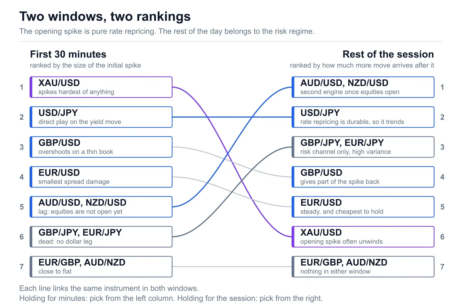
This is the most useful thing in the post, and almost nobody separates the two windows. The 8:30–9:00 window and the full session are driven by different forces, so they produce different tables. If you pick your instrument off the session table and then hold it for eleven minutes, you have used the wrong list.
The first 30 minutes: pure rate repricing
In the opening window there is exactly one story: the market is recalculating the Fed path. Correlations across the majors go to roughly one. EUR/USD, GBP/USD and AUD/USD all move the same direction at the same instant with the same shape, because they are all measuring the same thing. Nothing has had time to differentiate.
In that window the ranking is decided by rate sensitivity and by spread damage, and it looks like this:
- XAU/USD and USD/JPY spike hardest. Both are direct plays on the yield move, and both have a large enough tick size that the move is immediately obvious.
- GBP/USD overshoots. Thinner book, wider initial gap, and a partial retrace within minutes that looks like a reversal signal and usually is not.
- EUR/USD moves less in absolute terms but suffers the least spread damage, so on a net-of-cost basis it frequently ends up ahead of GBP/USD in this window.
- AUD/USD and NZD/USD lag. They get the dollar leg but not yet the risk leg, because equities have not opened and the risk story has not formed.
- Non-USD crosses do close to nothing. EUR/GBP on a CPI print is often flat while every dollar pair on the screen is having a seizure.
The cost trap in this window. Every broker widens spreads through the release, and the widening is not proportional across instruments. EUR/USD typically widens by a modest multiple of its normal spread. Gold, the JPY crosses and the minors widen far more, and stay wide for longer. That means the instrument with the biggest raw range is not necessarily the one that pays you most — and the first 30 minutes is precisely the window where that gap is largest. Check your own broker’s CPI-day spread history on the instrument before you assume the range is capturable.
The full session: the risk regime takes over
By mid-morning the rate move is priced. What happens next is a second, slower story about what a tighter or looser Fed means for growth and for equities, and that story reorders the table.
The commodity dollars climb. AUD/USD and NZD/USD pick up their second engine once equities open and the risk regime asserts itself. A hot print that has already sold AUD on the rate channel sells it again on the risk channel. Their full-session range frequently exceeds their 30-minute range by a bigger multiple than any other pair on the board.
USD/JPY often keeps going. Rate-path repricing is durable in a way that risk sentiment is not. When the market genuinely changes its view on the number of cuts left this year, USD/JPY tends to trend for the rest of the session rather than mean-revert. This is the single best argument for choosing it if you intend to hold past lunch.
Gold frequently unwinds. The initial gold spike is often the most emotional move of the day and the most likely to be given back, because the real-yield calculation takes longer than 30 seconds to settle. Gold’s session range stays large; its net session move is far less reliable than its opening spike suggests.
The crosses wake up, sometimes. GBP/JPY and EUR/JPY do nothing in the first window and can then produce the largest move of the afternoon, purely on the risk channel. That is not a reason to trade them — it is high variance dressed as opportunity — but it explains why people remember them as CPI movers.
The practical version: if you are holding for minutes, pick for rate sensitivity and spread. If you are holding for the session, pick for the risk channel. Those two criteria point at different instruments, which is exactly why one ranking is not enough.
4. USD/JPY — why the yen tops the FX table
USD/JPY is the most rate-sensitive major, and CPI is a rate event. That is the whole explanation, but the mechanism is worth spelling out because it also tells you when the rule breaks.
The Bank of Japan has spent years at the far end of the policy spectrum from the Fed. That leaves an unusually wide policy gap, and USD/JPY behaves less like a currency pair and more like a leveraged expression of the US yield curve — it tracks US Treasury yields more tightly than any other major. When CPI reprices the expected Fed path, it reprices exactly the thing USD/JPY is priced off. Everything else in FX gets the dollar effect second-hand; USD/JPY gets it directly.
There is a second channel that mostly reinforces the first. The yen is a funding currency, so it strengthens when risk appetite collapses. On a hot CPI print those two channels fight: rates say sell yen, risk-off says buy yen. In practice the rate channel usually wins on the day and the risk channel shows up as chop and long wicks. We went deeper into the structural side of this in why the yen keeps falling.
When the rule breaks
Two situations. First, when USD/JPY is trading near a level the Ministry of Finance has previously defended, the pair stops behaving like a yield instrument and starts behaving like a coiled spring with a policy risk attached. A hot print into that zone can produce a smaller move than the same print fifteen figures lower, because participants size down against intervention risk.
Second, when the BoJ is in its own tightening story, the differential narrows and the sensitivity drops. The ranking is not a law of physics; it is a description of a policy configuration that has held for a long time and will not hold forever.
5. Gold — real yields, not the headline
Every CPI day produces a wave of people complaining that gold went the wrong way. Inflation came in hot, gold is an inflation hedge, gold sold off — therefore the market is rigged. It is not rigged. Gold is not trading the headline.
Gold is a zero-yield asset. Its opportunity cost is the real yield you could earn instead: roughly the nominal Treasury yield minus expected inflation. When real yields rise, holding gold gets more expensive and gold falls. When real yields fall, gold rallies. That is the relationship that actually drives the price, and it is the one CPI acts on.
Why a hot print can send gold either way. A hot CPI raises two things at once. It raises nominal yields, because the market prices a tighter Fed. It also raises expected inflation. Real yield is the first minus the second, so whichever rises more decides the direction. Nominal moves more → real yields up → gold down. Inflation expectations move more → real yields down → gold up on a hot print. Both outcomes are entirely consistent with the same mechanism, which is why “hot CPI means gold up” is not a rule and never was.
There is a third input on top: the safe-haven bid. If a print is hot enough to raise genuine hard-landing fear, gold can catch a flight-to-quality bid that overrides the real-yield arithmetic entirely for a few hours. Three channels, occasionally pointing three different directions, is why gold’s CPI reaction is the widest and also the least tradeable on a simple directional read.
The dollar leg matters too, and it is the boring part people forget: gold is quoted in dollars, so a stronger dollar mechanically pressures the price before any of the yield story is considered. The inverse gold-dollar correlation is real, it is just not the whole story on a CPI day.
If you do choose gold, choose it deliberately. Our guide to the best time to trade XAU/USD covers the session behaviour, and the short version for CPI day is: the range is real, the spread widening is worse than you expect, and you need a view on real yields rather than on the headline before you press anything.
6. EUR/USD — range per unit of cost
EUR/USD will almost never win the range contest, and it is still the right answer for most traders on most CPI days. The reason is a metric nobody publishes: range per unit of cost.
EUR/USD is the most heavily traded pair in the world. That translates into three concrete advantages on a news release, and all three matter more than raw pips:
The tightest baseline spread
You start every trade less far behind. On a strategy that pays 20 pips when right, a two-pip cost difference is 10% of the gross. That compounds across a year of CPI prints faster than most people model.
The smallest proportional widening
Spreads blow out everywhere at 8:30. They blow out least, and normalise fastest, on the deepest book. This is the advantage that specifically shows up on news days and is invisible the rest of the month.
The least slippage on a stop
A stop is only worth what it actually fills at. In the seconds after a release, depth is what decides whether your stop is a level or a suggestion — and depth is where EUR/USD is untouchable.
There is also a cleanliness argument. EUR/USD is the purest dollar expression available: no commodity beta, no funding-currency behaviour, no intervention overhang, no meaningful safe-haven distortion. If your thesis is “this print makes the dollar stronger”, EUR/USD tests that thesis and nothing else. GBP/USD adds a sterling story, AUD/USD adds a risk story, USD/JPY adds an intervention story. Every extra story is another way to be right about CPI and lose money anyway.
The honest counterpoint: if you trade a fixed pip stop and need a certain minimum range to make the risk-reward work, EUR/USD can genuinely be too small on a soft print. That is a real constraint, not a preference. But it is a reason to size differently, not a reason to reach for a wider, dirtier instrument.
7. The commodity dollars — two engines, one direction
AUD/USD and NZD/USD are the pairs that most reward patience on a CPI day, because their second engine takes time to start.
Engine one is the dollar leg, same as everything else. Engine two is risk appetite. Both the Aussie and the Kiwi behave as high-beta risk currencies: when equities fall they fall, when equities rally they rally. A hot CPI print typically strengthens the dollar and pressures equities, which means AUD/USD receives two pushes in the same direction, separated by roughly an hour.
This is why AUD/USD looks unimpressive in the first ten minutes and can be one of the day’s biggest movers by the close. It is also why AUD/USD occasionally does something that looks irrational — a cool print weakens the dollar (AUD up) but is read as evidence of slowing demand (AUD down), and the two engines fight to a draw.
The practical costs are real. Pip value is smaller, relative spread is wider than EUR/USD, and the book is thinner during the New York morning than it is during the Asian session. NZD/USD is a worse version of AUD/USD on every one of those counts, and it is rarely worth choosing over AUD unless you have a specific RBNZ story running alongside.
USD/CAD is the odd one out and deserves a sentence of its own. Canada is economically joined at the hip to the US, and CAD is the major that moves most with the dollar in broad dollar episodes. So when a hot print sends the dollar up against everything, CAD falls the least, and USD/CAD produces the smallest range of the USD majors. That makes it structurally the quiet one, which is occasionally exactly what you want and usually not why people open it.
8. Why the crosses are the wrong instrument
Take EUR/GBP on a hot US CPI. The dollar strengthens. EUR/USD falls. GBP/USD falls. EUR/GBP is the ratio of those two, so the common dollar move divides out and what is left is only the small difference in how each leg responded. You have removed the event from the instrument.
Some traders talk themselves into crosses on CPI day anyway, usually with an argument like “the euro is more rate-sensitive than sterling here, so the residual should favour short EUR/GBP.” That can even be true. It is also a second-order bet on a second-order effect, paying a wider spread, on the one day of the month when first-order effects are enormous and free to trade. It is a hard way to make an easy day difficult.
The one legitimate use. Crosses are the right tool if your goal is the opposite — you want to hold a position through the release without taking dollar risk. If you have a genuine EUR-versus-GBP view and no view on CPI, the cross is where the dollar shock cancels out and your actual thesis survives contact with the release. That is a hedging decision, not a news-trading decision, and it is the only version that makes sense.
The JPY crosses are a separate case, and the reason they confuse people. GBP/JPY and EUR/JPY contain no dollar leg either, so in the first window they are dead. But they are pure expressions of the risk channel, and if a print triggers a real equity move they can end the day as the widest thing on the board. High variance, wide spreads, brutal slippage. They are not a shortcut to volatility — they are a lottery ticket on a second-order channel.
The related mistake is subtler and much more common: opening EUR/USD, GBP/USD and AUD/USD short on the same hot print, and calling it three positions. In the first 30 minutes of a CPI release those correlations run close to one. It is one dollar trade at three times the size, with three times the spread bill. Our correlation guide has the full map of which pairs collapse into each other and when.
9. Where the shortlist comes from
The ranking above is the structural version — the order that holds on an average CPI day. The version that matters is the one for this CPI day, because the current policy configuration, the state of the risk regime and what else is on the calendar all shift the list.
Step one is knowing the release is coming and what is expected. Forex Factory’s calendar and Trading Economics’ US inflation page both carry the consensus forecast and the history; if the calendar itself is unfamiliar territory, start with how to read an economic calendar.
Step two is turning that into a shortlist of instruments, which is the part that takes work. ChartSnipe’s News Impact analysis publishes 12 AI-ranked pairs for the upcoming session with a bullish or bearish bias, live price and daily percentage change on each. On a CPI day that ranked list is a pair-selection shortlist — it has already done the “which instrument carries this story” step across 32 instruments and handed you twelve.
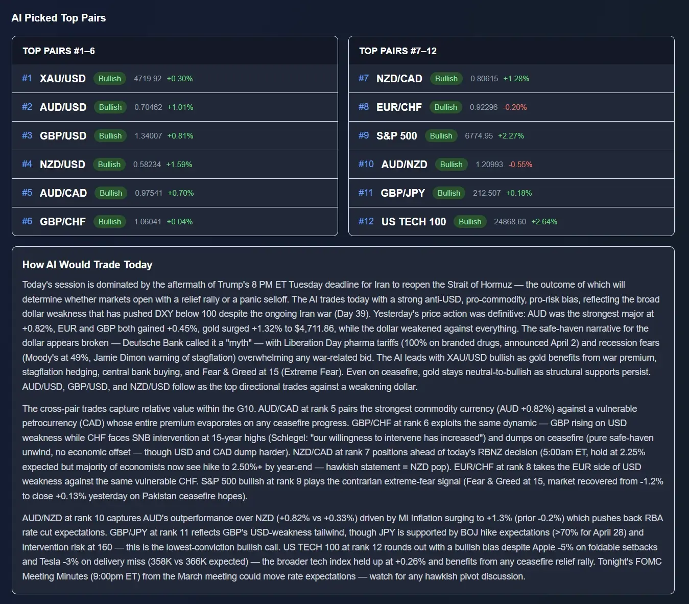
The other half is the Risk Analysis block, which lists the scenarios that would break the day — each with a severity level, the trigger, the market impact and, usefully for pair selection, the specific instruments it would hit. On a CPI day that is where you find out which of your candidate pairs has a second, unrelated landmine attached to it.

There are also individual currency and instrument cards — a bias, a rank and the reasoning for each of the majors plus gold, Bitcoin and the indices — which is where a rate-path story or an intervention risk gets stated explicitly rather than inferred from a chart.
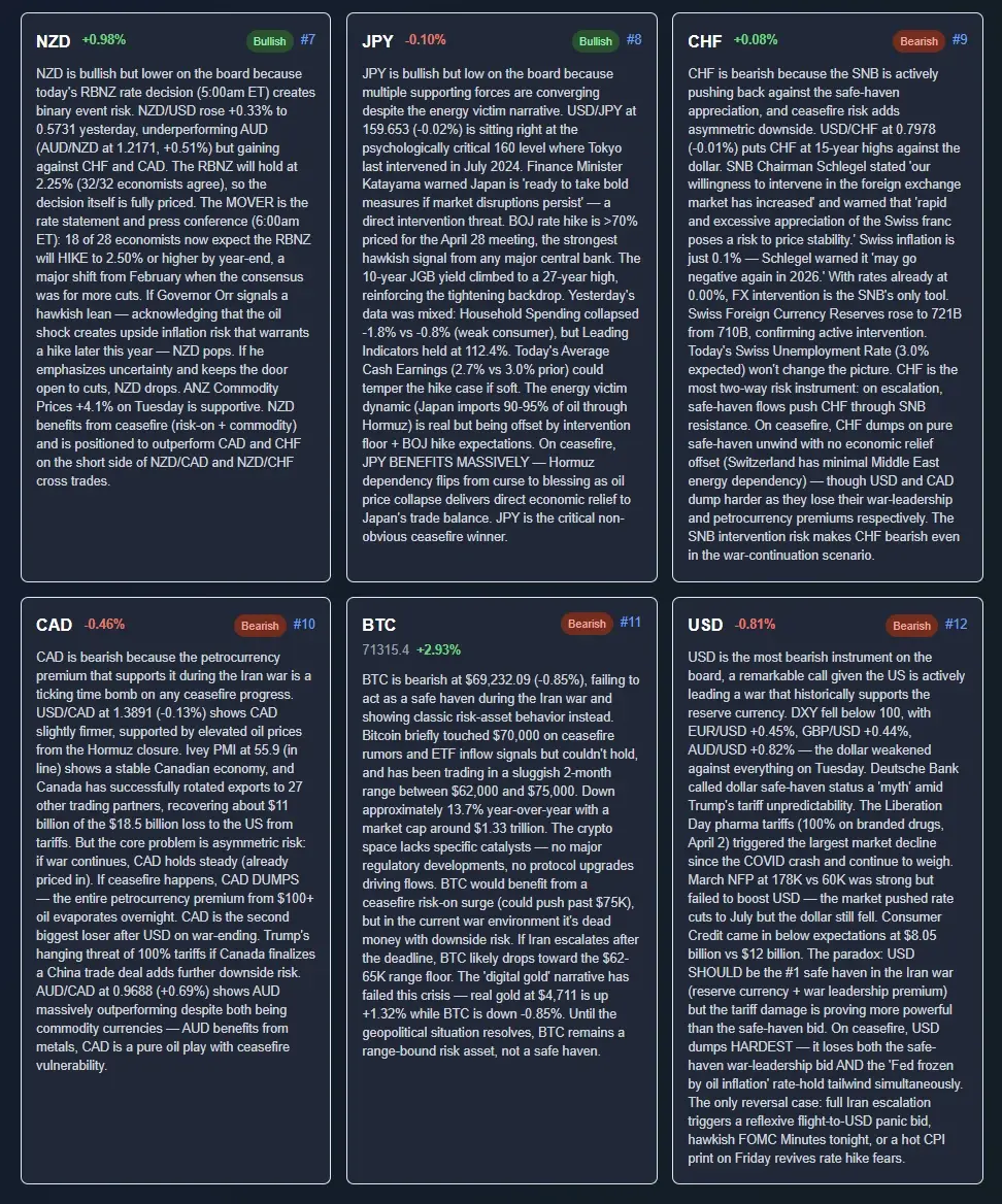
How it is published. News Impact goes out on trading days only, Monday to Friday, between 20:00 and 23:00 UTC, for the upcoming session — so a CPI-day shortlist is available the evening before, which is when pair selection should actually be done. It is an in-app page rather than a newsletter, and the full analysis is a Pro and Premium feature; free accounts see an admin-featured past-day preview so you can look at the format before deciding. There is no weekend edition.
10. Pair selection rules
Seven rules. They are all about the choice, not the execution — the execution side is a separate discipline covered here.
Rule 1 — USD-quoted or nothing
The event is applied to the dollar. If your instrument has no dollar leg, you have opted out of the event and kept the spread. There is no version of this rule with an exception, other than the deliberate hedge in section 8.
Rule 2 — One instrument, not a basket
Three correlated dollar pairs is one position at triple size and triple cost. Choose the single best expression of your view and size it properly, rather than spreading the same bet across a screen and calling it risk management.
Rule 3 — Match the instrument to the story you expect
Rate-path repricing lands hardest in USD/JPY. A risk-appetite spillover shows up best in AUD/USD or an index. No strong view beyond dollar direction, which is the honest position most of the time, means EUR/USD.
Rule 4 — Match the instrument to your holding period
Minutes: rate sensitivity and spread decide, which favours USD/JPY and EUR/USD. Full session: the risk channel decides, which favours the commodity dollars and the indices. Picking off the wrong list is the most common instrument error on the day.
Rule 5 — Price the cost before you admire the range
Look at what your own broker actually did to that instrument’s spread during the last three CPI releases. Not the advertised spread — the 8:30 spread. A 60-pip gold range you pay 40 pips to enter and exit is worse than a 20-pip EUR/USD range you pay 2 for.
Rule 6 — Only take gold with a real-yield view
Gold is the widest instrument on the board and the one most likely to punish a correct read on the headline. If you cannot say whether nominal yields or inflation expectations will move more on this print, you do not have a gold trade — you have a coin flip with a wide spread.
Rule 7 — Decide the night before
Instrument selection made at 8:29 is instrument selection made under pressure, and it defaults to whatever chart happens to be open. Write the shortlist down the evening before, along with the reason each candidate is on it. If you cannot state the reason, remove it.
One thing worth saying plainly, since this whole post is a ranking: none of this tells you a CPI day is worth trading. Plenty of good traders flatten before 8:30 and come back at 10:00, and that is a defensible answer to the same question. The ranking exists so that if you do participate, you participate in the instrument that pays for the risk you are taking — not in whichever pair happened to be on your screen.
And if the print lands exactly on forecast, the correct instrument is often none of them. A CPI that surprises nobody produces a session where every pair in the table above does nothing at all, and the traders who lose money on those days are the ones who showed up committed to trading rather than committed to a setup.
Frequently asked questions
Which currency pairs move most during CPI?
USD-quoted instruments, because CPI repricing hits the dollar leg directly. In pure FX, USD/JPY is consistently the widest of the majors thanks to the yen’s outsized rate-differential sensitivity. Gold travels further than any FX pair but is the least predictable in direction. GBP/USD runs slightly hotter than EUR/USD, and AUD/USD and NZD/USD pick up an extra risk-regime push later in the session. Non-USD crosses like EUR/GBP move least, because the dollar shock hits both legs and cancels.
How does CPI affect EUR/USD?
A hotter-than-expected print pushes the market to price a higher-for-longer Fed, which lifts US yields and bids the dollar, so EUR/USD falls. A cooler print does the reverse. Size is set by the surprise against forecast, not the level of inflation. What makes EUR/USD distinctive is cost rather than size: deepest liquidity, tightest spread and the smallest proportional widening at 8:30, which makes it the best range-per-unit-of-cost instrument on the day even though it is rarely the biggest mover.
How does CPI affect the gold price?
Gold trades real yields, not the headline. A hot print raises nominal Treasury yields and inflation expectations at the same time; real yields are roughly the first minus the second, so whichever moves more sets gold’s direction. Nominal moving more means real yields rise and gold falls. Inflation expectations moving more means real yields fall and gold can rally on a hot number. That is why gold sometimes looks like it went the wrong way, and why a view on the headline alone is not a gold trade.
What pairs should you trade on CPI day?
Pick a USD-quoted instrument, and pick one rather than three. Rate-path view: USD/JPY. Risk-appetite view: AUD/USD or a US index. No view beyond dollar direction: EUR/USD, which is the default for good reason. Avoid non-USD crosses, avoid stacking correlated dollar pairs, and avoid gold unless you have specifically formed a view on real yields.
Why does USD/JPY move the most on CPI?
Because it is the most rate-sensitive major. The Fed–BoJ policy gap has been the widest in the G10 for years, and USD/JPY tracks the US yield curve more closely than any other pair. CPI is a rate-path event in market terms, so the instrument priced most directly off the rate path reprices hardest. The yen’s funding-currency behaviour adds a second channel that can partly offset the first, which shows up as chop rather than as a smaller move.
Do the rankings change between the first 30 minutes and the full session?
Yes, and it is the most useful thing to know. The opening window is pure rate repricing: USD/JPY and gold spike hardest, the majors move in near lockstep, crosses barely move. Over the full session the risk regime takes over: the commodity dollars pick up a second push, USD/JPY often keeps trending because rate repricing is durable, and gold frequently unwinds a large part of its initial spike. Pick from the list that matches the window you actually intend to hold.
Is USD/CAD good to trade on CPI?
It is usually the dullest USD major on the day, and structurally so. Canada’s economy is tightly integrated with the US and CAD is the G10 currency most positively correlated with USD in broad dollar moves, so when the dollar rallies against everything CAD falls least and USD/CAD travels least. Reasonable if you want dollar exposure with a smaller range and stop. Poor if you came for volatility.
Should you trade EUR/GBP or AUD/NZD on CPI day?
No. US CPI is a dollar event and a non-USD cross has no dollar leg, so most of the move cancels and you are left paying a wider spread for a second-order residual. The one legitimate use is the opposite case: if you have a genuine EUR-versus-GBP view and no CPI view, the cross is where the dollar shock nets out and your actual thesis survives the release.
Sources & further reading
- US Bureau of Labor Statistics — Consumer Price IndexThe release itself, plus the methodology behind headline and core CPI. The primary source, not a summary of one.
- BLS — CPI release scheduleDates fixed a year ahead, all at 8:30 a.m. Eastern. Worth checking directly rather than trusting a third-party calendar.
- Federal Reserve — Statement on Longer-Run Goals and Monetary Policy StrategyWhere the 2 percent longer-run inflation goal is stated. Useful context for why CPI is read as a Fed-path signal rather than as a target measure.
- Trading Economics — United States Inflation RateConsensus forecast and the historical series in one place, which is what you need to judge the surprise rather than the level.
- Forex Factory — economic calendarThe standard retail calendar, with impact tags and previous-versus-forecast columns for every release on the CPI day.
Get the shortlist before the print, not after
ChartSnipe News Impact publishes 12 AI-ranked pairs for the upcoming session with a directional bias on each, plus Risk Analysis scenarios showing which instruments each risk would actually hit. On a CPI day that ranking is your pair-selection shortlist, and it is out the evening before — when the decision should be made.
Keep reading
- → How to trade the news — NFP, CPI and FOMC execution
- → High-impact forex news events, ranked
- → How to read an economic calendar
- → Forex correlation — which pairs move together
- → The best time to trade gold (XAU/USD)
- → Why the yen keeps falling — USD/JPY in 2026
- → Why the US dollar is strong — reading the DXY