
How AI Scores Economic Events 1 to 10
Every new AI calendar ships a 1-to-10 impact number and almost none of them will tell you what is in it. Here is the model built out in the open — the seven inputs that genuinely belong, why three colours throw away most of the information, and why any score that never changes is wrong by construction.
Somewhere in the last two years, “impact score: 8/10” became standard vocabulary. Every AI-flavoured economic calendar has one. None of them publish a methodology, and if you sit with a few of these products side by side for a month you notice something telling: the number never moves. US CPI is an 8 in January and an 8 in July. The scale has ten values and the product uses about four of them, forever.
That is a lookup table with a decimal point bolted on. It is a slightly higher-resolution version of the red-amber-yellow tag it replaced, and it inherits the same flaw: it describes the release rather than the event. Those are different things, and the difference is where all the trading value lives.
This piece does two jobs. First, it builds the scoring model out in the open — the seven inputs that genuinely belong in one, what each contributes, and which of them everyone quietly skips. Second, it makes the argument that matters more than any of the inputs: a static score is wrong by construction, because impact is conditional. The same CPI print is a 4 or a 9 depending on nothing but what the central bank is currently arguing about. At the end there is a six-question test you can run against any vendor’s number, including ours.
Key Takeaways
- →Three colours force events that differ by an order of magnitude into one bucket. That is the actual problem a score is supposed to solve.
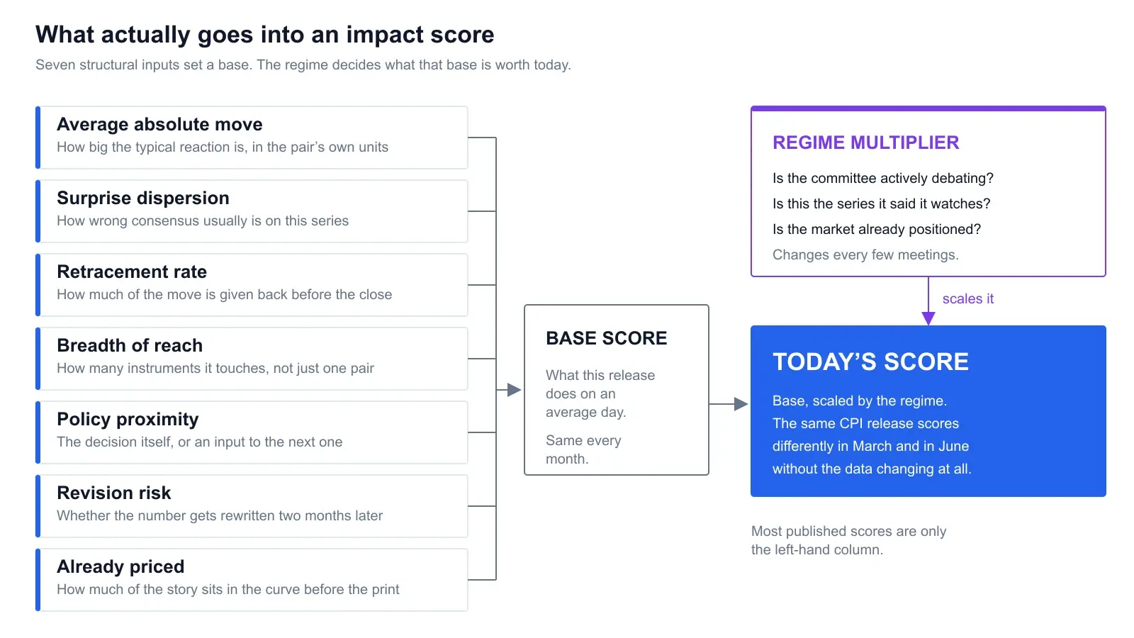
- →Seven inputs earn a place: average absolute move, surprise dispersion, retracement rate, breadth of reach, policy proximity, revision risk, and what is already priced.
- →Surprise dispersion is the input people miss. A series economists forecast accurately cannot surprise anybody, however important it sounds.
- →Reach beats magnitude for most traders. An event that moves one cross hard is worth less to you than one that moves eight instruments you actually hold.
- →A static score is wrong by construction. The same release scores differently depending on whether the committee is actively debating a move.
- →The cleanest tell of a fake score: it never changes month to month, and it never names the instruments it expects to move.
- →A score is a triage tool for your attention, not a position-sizing input. Nobody should be trading a number they cannot decompose.
1. What a 1-to-10 is actually claiming
Write out the claim in full and it gets uncomfortable quickly.
An impact score of 8 asserts something like: this release, at this time, is expected to produce a market reaction in the top decile of scheduled events, across a meaningful set of instruments, that persists long enough to matter. That is four separate claims — magnitude, breadth, persistence, and a probability distribution over all of them — compressed into one integer.
Compression is fine. That is what a score is for. A calendar row cannot carry a research note, and a trader scanning tomorrow’s events needs a triage signal, not a paper. The problem is not that a score simplifies. The problem is when the simplification discards the exact information you needed and then hides the fact that it did.
The distinction the whole article turns on. There is the release — a data series published on a schedule, with fixed methodology and a fixed reporting agency. And there is the event — that release landing on a specific date, into a specific set of market expectations, in front of a specific policy committee with a specific set of open questions. The release is constant. The event is not. Score the release and you get a lookup table. Score the event and you get something worth reading.
If you have not spent much time with calendar mechanics, the companion piece on how to read an economic calendar for forex covers the columns themselves — actual, forecast, previous, and what the time zone selector is quietly doing to your day. This piece assumes all of that and goes one level down, into how the impact column gets its value in the first place.
2. Why three colours are too coarse
The retail standard for two decades has been a three-bucket tag: high, medium, low, usually rendered as a red, orange and yellow folder icon. It was a genuine improvement on nothing. It is also, now, the single biggest source of avoidable confusion in news trading.
Here is the failure in one sentence. On a typical week, an FOMC decision with a press conference and a preliminary University of Michigan consumer sentiment survey both carry the top tag. Those two events are not in the same category of anything. One resets the discount rate the entire world prices off, moves every G10 pair, gold and the major indices, and produces a level shift that is still visible on a weekly chart. The other is a survey revision that frequently does not register on a 15-minute candle.
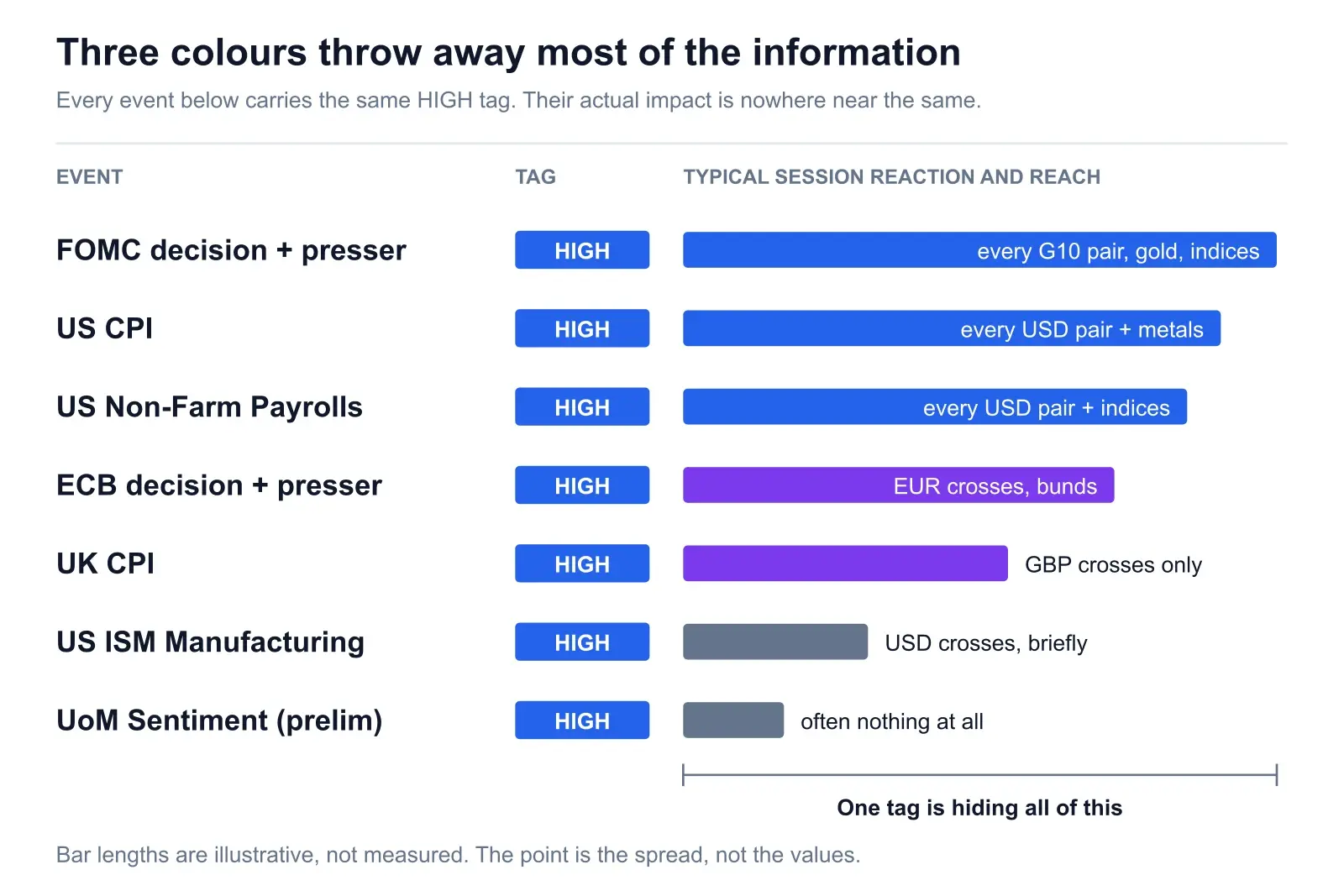
Two consequences follow, and both cost money. The first is false alarms: you flatten a position ahead of a top-tagged event that was never going to do anything, and you eat the spread twice for nothing. Do that eight times a month and the tag has an explicit cost. The second is worse — desensitisation. After enough top-tagged events pass without incident, you stop respecting the tag, and then a real one arrives while you are carrying size.
A finer scale does not automatically fix this. A ten-point scale that is really a four-point scale in disguise — the vendor only ever emits 5, 7, 8 and 9 — has the same information content as the tag and less honesty about it. Resolution is only worth something if the extra levels are carrying real distinctions. Which means you have to know what goes into them.
For the ranked list of which releases deserve the top tier in the first place — and which ones only look important — our breakdown of the high-impact forex news events that actually move price goes release by release.
3. The seven inputs that genuinely belong
These are the components that, in our view, earn a place. Each one answers a different question, and dropping any of them produces a specific, predictable failure mode.
1. Historical average absolute move
The obvious one. Over the last few dozen instances of this release, how far did the affected instruments travel in the first fifteen or sixty minutes, sign ignored?
Two constraints on doing this honestly. Measure in volatility units, not pips — a 40-pip reaction in USD/JPY and a 40-pip reaction in EUR/GBP are not comparable events, because their baseline ranges differ by a lot. Normalising by something like recent average true range makes the numbers mean the same thing across instruments. And use the median or a trimmed mean rather than a raw average, because one crisis-era print will otherwise carry the whole estimate.
What this input alone gets wrong: it is entirely backward-looking. It scores the average of a distribution and tells you nothing about the tails, which is where the actual risk to your account lives.
2. Surprise dispersion
This is the input most people leave out, and it is arguably the most important. Markets do not move on data. They move on the gap between data and expectation. Which means a release can only produce a big reaction if consensus is capable of being badly wrong about it.
Some series are forecast tightly. Economists cluster within a narrow band and the print usually lands inside it, because the underlying data is partially observable in advance through regional surveys, weekly claims, or already-published components. Other series are genuinely hard, and the standard deviation of the forecast distribution is wide relative to the typical value. A release nobody can predict is worth more score than a release everyone predicts correctly, even if the second one sounds more important.
The practical measurement is the historical distribution of actual minus consensus, scaled by the series’ own units. Trading Economics carries the consensus alongside the full historical series for most major indicators, which is enough to build this by hand for the dozen releases you actually trade.
Why this input flips intuitions. Headline events with tight consensus and pre-released components tend to be quieter than their reputation. Second-tier events attached to a series economists genuinely struggle with can produce reactions well out of proportion to their tag. If you have ever wondered why a “minor” release blew through your stop, the answer is usually here: the event was small, but the surprise was large, and only the surprise gets traded.
3. Retracement rate
How much of the first move is given back before the session closes? This separates events that reprice from events that merely disturb.
A policy decision that changes the expected rate path produces a level shift. Price goes somewhere and stays roughly there, because the thing that determines fair value changed. A second-tier survey miss produces a spike into thin liquidity that market makers fade back over the next hour, because nothing about fair value moved — only the order book did.
These deserve very different scores and they routinely get the same one, because the naive measurement window is the first five minutes, where they look identical. Measuring the move at 5 minutes and again at the session close, and scoring the ratio, is a small change that fixes a lot. It also happens to be exactly the distinction a swing trader cares about and a scalper does not, which is a hint that a single global score can never serve both.
4. Breadth of reach
How many instruments does this event actually touch? For most traders this matters more than magnitude, and almost no published score carries it.
The tiering is not subtle once you look for it:
| Reach tier | Typical events | What it touches |
|---|---|---|
| Global | FOMC decision and projections, US CPI | Every USD pair, gold, major indices, crypto by correlation. The world prices off this curve. |
| Bloc | ECB, BoE, BoJ decisions | That currency’s full cross set plus domestic bonds, spilling wider only through risk sentiment. |
| Currency | National CPI, employment, GDP | That currency’s crosses, and it stops there. Real for the eight pairs it hits, irrelevant elsewhere. |
| Pair | Regional surveys, minor sentiment prints | One or two crosses for twenty minutes. Genuinely tradeable if that is your pair; noise otherwise. |
A single number cannot express this, which is why an honest score should be shipped with an instrument list attached. “7/10” is not actionable. “7/10, expect it in GBP crosses and gilts, nowhere else” is. If you want a concrete worked case of reach, we mapped it release by release in which pairs move most on CPI.
5. Policy proximity
Is this event the decision, or an input to the decision? The gap between those two is enormous and it is not constant.
A rate decision plus statement changes the path directly, in one step. Inflation and labour data change it indirectly, and only to the extent that the committee has said it is watching that series. This is why reading the actual statements matters so much for scoring: when a central bank explicitly names the thing it needs to see, every subsequent print of that thing gets a promotion. The FOMC statements, minutes and projection materials and the ECB monetary policy statements and Q&A transcripts are both published free and in full, and both are where the promotion gets announced — usually in a clause, not a headline.
Note that policy proximity is already halfway to being a regime variable, which is the thread section 4 pulls on.
6. Revision risk
Almost universally omitted, and it changes how much a number deserves to be believed.
Some headline series are provisional by design. The US establishment survey behind non-farm payrolls revises its initial monthly estimate twice, in the two months immediately following, as more businesses in the sample report their data — and it is separately re-anchored each year to a near-complete count drawn primarily from unemployment insurance tax records. That is documented method, published by the agency itself, not a criticism of it; the tradeoff is timeliness against completeness, and users want the early read. The BLS revisions series between over-the-month estimates is public back to 1979, and the explainer “Why are there revisions to the jobs numbers?” sets out exactly why.
For scoring purposes the implication is narrow but real: a first print that will be rewritten produces a move with less durability behind it than a final number or a policy decision, and traders who know that behave differently in the hour after the release. A score that treats a heavily revised provisional estimate identically to a rate decision is mispricing persistence, which is one of the four things it claimed to be measuring.
The same logic applies to methodology footnotes generally. Seasonal adjustment, basket reweighting, and definitional changes all sit in the primary documentation — the BLS Consumer Price Index FAQ is a fair sample of how much of this exists that nobody reads.
7. How much is already priced
The last input, and the one that is hardest to compute and easiest to justify.
If the market has spent three weeks positioning for a hot inflation print, a hot inflation print is worth close to nothing. There is nobody left to buy. The reaction to a confirmed expectation is frequently a fade, which is why “good number, currency falls” keeps surprising people who are watching the data rather than the positioning around it.
You can approximate this without a terminal. Where has the forward curve moved since the last instance of this release? Has the pair already travelled a long way in the direction the expected print would imply? Is the consensus itself an outlier relative to the last few months? Each of those is a partial read on how much of the story is in the price. None of them is precise, and a score that pretends to precision here is lying — but a score that ignores the question entirely is worse.
4. Why a static score is wrong by construction
Everything in section 3 gives you a base score. It is a real number and it is genuinely useful. It is also, on its own, structurally incapable of being right.
Here is why. Six of the seven inputs are properties of the release: its historical behaviour, its forecast difficulty, its fade profile, its instrument coverage, its revision schedule. Those are close to constant. Feed them into a model and you get a number that is the same in January and July, because the things it is made of are the same in January and July.
But the question a trader is actually asking is not “how important is this data series in general.” It is “how much can this print change what happens next?” And the answer to that depends almost entirely on something outside the release: what the central bank is currently arguing about.
The regime multiplier. Three questions, asked fresh for every event. Is the committee actively debating a move, or has it made clear it is done? Is this the specific series it named as the thing it is watching? And has the market already taken a position on the answer? A release that scores highly on the structural inputs but lands into a committee that has told everyone it will not move for six months has had its ceiling cut. The same release into a live debate has had its ceiling raised.
This is not a refinement. It is the dominant term. In a stable regime a top-tier release can pass with a reaction you would not have noticed; in a live one, a second-tier release can move the whole week. Any score that cannot express that difference is measuring the wrong object, and the fact that it is measuring the wrong object very precisely does not help.
Where the regime is announced
The useful thing about the regime term is that it is not secret. Central banks tell you, at length, on a schedule. The vote split tells you whether the committee is unified. The statement language tells you what conditions would change its mind. And the press conference Q&A is where governors get pushed off the prepared script and into specifics — which is why the Q&A, not the statement, is usually where the regime shift becomes visible.
The Bank of England’s Monetary Policy Report press conference of 30 April 2026, published in full on the Bank’s own channel. Watch what the questions push the committee into conceding — that is where you find out which series has just been promoted, and therefore which calendar rows deserve a higher score for the next few months.
This is also where a language model earns its keep, honestly. Reading every statement, every minutes release and every scheduled speech across four or five central banks, and tracking which conditions each committee has named, is tedious rather than clever — which is exactly the shape of work that automates well. We went through the mechanics of that in how AI reads financial news for trading.
5. The same CPI print, two regimes
The argument is easier to accept as a worked case. Same release, same clock time, same consensus figure, two different policy backdrops.
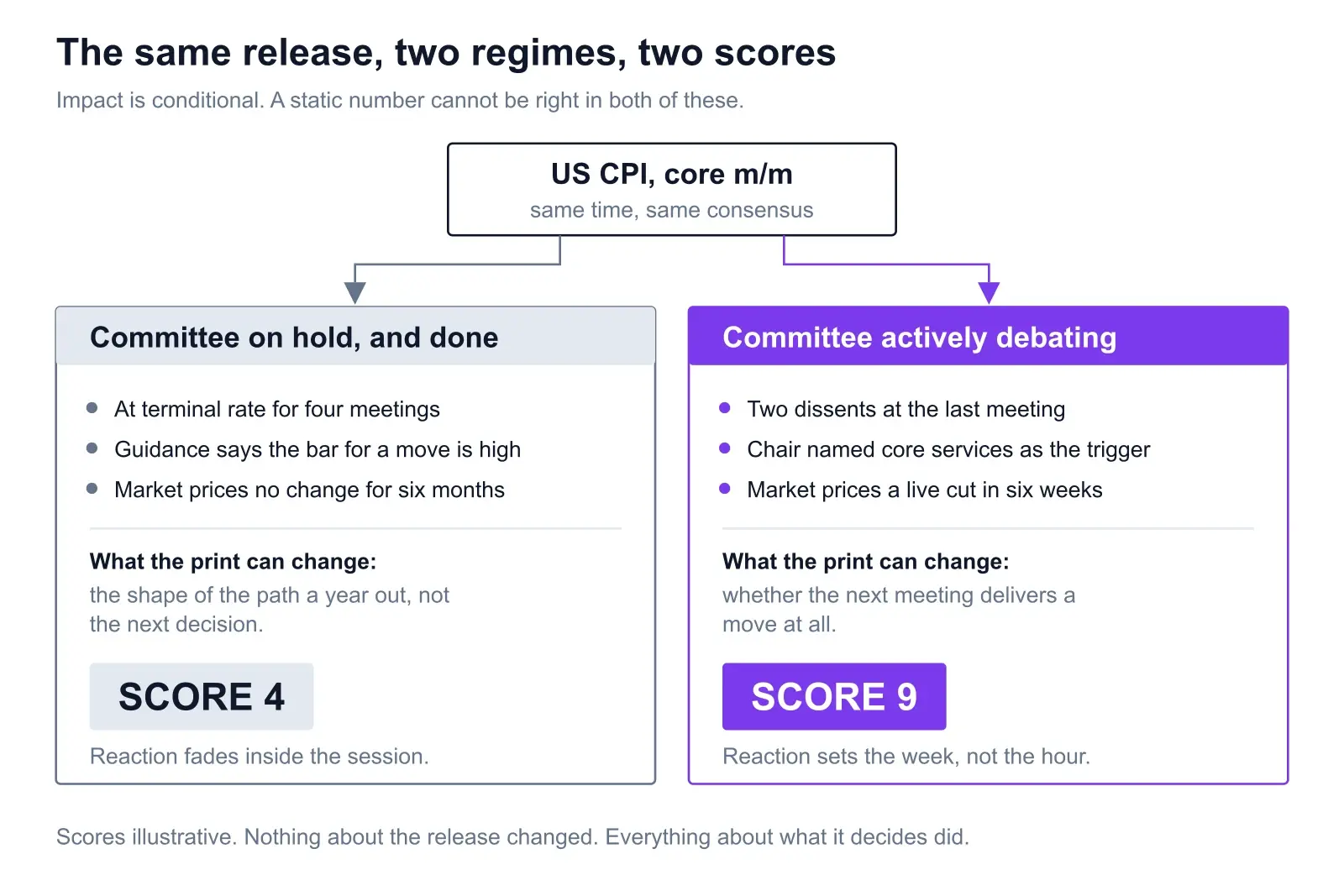
Regime A: on hold, and done with it
The policy rate has sat at its terminal level for four consecutive meetings. The statement language says the bar for any change is high and repeats it without modification. Pricing implies no move for six months, and the vote has been unanimous each time.
What can a core CPI print do here? It can nudge the shape of the expected path a year out. That is a real thing, and rates desks will trade it. But it cannot change the next decision, because the committee has publicly removed the next decision from the table. The reaction is a first-minute spike that market makers fade, and by the close much of it is back. On the structural inputs alone, this release still looks like a top-tier event. In this regime it is not.
Regime B: an actively split committee
Two members dissented at the last meeting. The chair, under questioning, named core services inflation as the specific thing that would settle the argument. Market pricing has a genuine live probability on a move at the meeting six weeks out, and that probability has been swinging with each data point.
Now the same print decides something. Not the path a year out — the next meeting. Every desk with a rates position has to reprice on the number, and because the number was explicitly nominated as the deciding input, the repricing is immediate and it holds. This is where you get the level shifts still visible on a weekly chart. Same data, different job.
The test, stated plainly. Before any release, ask: what decision does this number change, and when is that decision taken? If the answer is “a decision six weeks away that is genuinely undecided,” you are in regime B and the calendar tag is probably understating it. If the answer is “nothing until next year,” you are in regime A and the tag is overstating it. That single question does more work than any vendor’s score.
It also cuts the other way, which is the part that surprises people. In regime B, releases that normally sit in the second tier get promoted — a services PMI sub-component, a wage growth revision, anything that speaks to the named condition. Traders who score events off a static table walk straight into those, because their table says 4 and the market is treating it as an 8.
6. Six questions to sanity-check any vendor’s number
You will not get a methodology document out of most of these products. You can still work out what is behind the number in about ten minutes, using the score itself as the evidence.
1. Does the score for one event ever change?
Pull up the same release across four or five past months. If US CPI is the same integer every single time, it is a lookup table. This one test disqualifies most of the field, and it takes two minutes.
2. Does it name the instruments?
A score attached to a currency flag and nothing else has skipped the reach input entirely. If it cannot tell you whether to expect this in eight pairs or one, it has not done the work that distinguishes a bloc event from a pair event.
3. Does it separate decisions from inputs?
Compare the score for a rate decision against the score for the CPI print feeding it. If they are similar, policy proximity is not in the model, and the product does not distinguish between changing the path and informing it.
4. Does it say anything about persistence?
A spike that fades and a level shift that holds should not carry the same label. If the product has no vocabulary for the difference, it is scoring the first five minutes and calling it impact.
5. Does it acknowledge what is already priced?
Look for any reference to positioning, forward pricing, or how far the pair has already travelled. If the score is identical whether the market is flat or three weeks into a one-way move, it is measuring the release in a vacuum.
6. Does it tell you what it is conditional on?
The best answer a scoring product can give is not a higher number. It is a sentence: this is a 9 because the committee is split and the chair named this series. A stated condition is falsifiable. An integer on its own is not, which is precisely why so many products ship the integer.
If you are shopping rather than building, the comparison piece on AI economic calendar analysis tools covers the product landscape and what each type is actually for. This one is only about the number.
7. What ChartSnipe does instead of a number
Worth being direct about this, since it would be easy to write eight sections attacking static scores and then quietly ship one.
ChartSnipe does not publish a 1-to-10 impact score. The economic calendar widget on the News Impact page uses Low, Medium and High impact levels, with a “How to Use” explainer attached. For a scheduled-event list that is the honest resolution: a calendar widget is a schedule, and a schedule cannot know which regime it is landing in.
The conditional work happens somewhere else, in the Risk Analysis output. Each scenario carries four things: a severity of High, Medium or Low; the specific trigger that would fire it; a written description of the expected market impact; and tags naming the pairs it would hit. That combination is a conditional score. The severity is not attached to an event type in the abstract — it is attached to a named trigger, under this session’s conditions, with a stated instrument list.
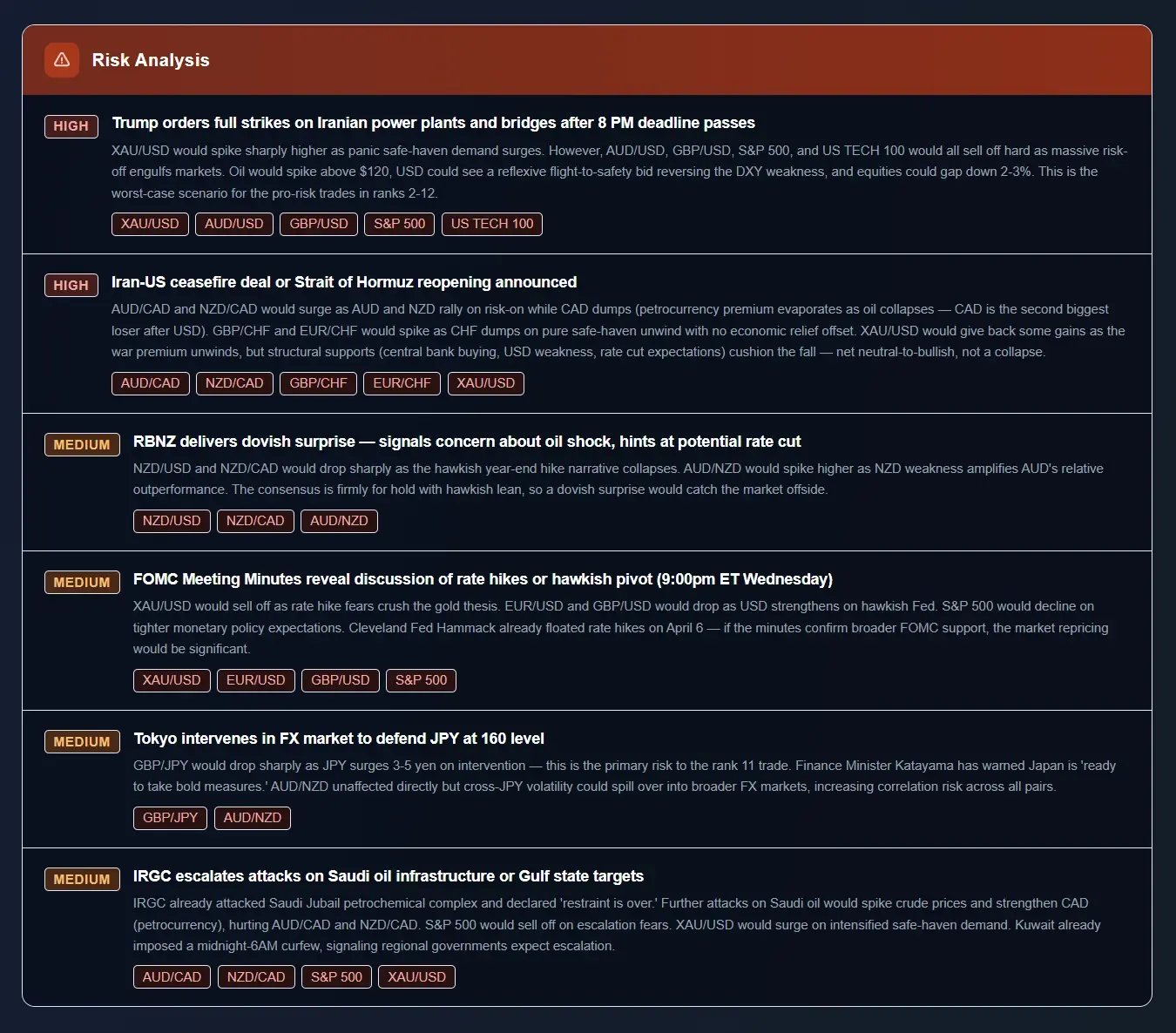
Because it is rebuilt for each session against that session’s conditions, the same underlying event can carry a different severity from one week to the next. A central bank decision that is a formality one month can be the top scenario the next, and the written trigger explains which one it is. That is what a regime-dependent score looks like when you write it in words instead of compressing it into an integer.
The published methodology is one sentence: “Our AI scans and synthesizes global financial news, official statements, central bank speeches, and economic calendar events to identify the highest-impact factors moving markets.” The order in that sentence is the interesting part — statements and speeches come before calendar events, which is the regime term being computed before the release term.
The other place ranking beats bucketing
A related design choice, for the same reason. Rather than tag every instrument with an independent conviction level, the analysis produces 12 ranked pairs in order. An ordinal ranking sidesteps the calibration problem entirely: you never have to decide whether something is a 7 or an 8, only whether it belongs above or below the thing next to it. Ranks 1 to 12 carry more usable information than twelve independent scores clustered between 6 and 8.
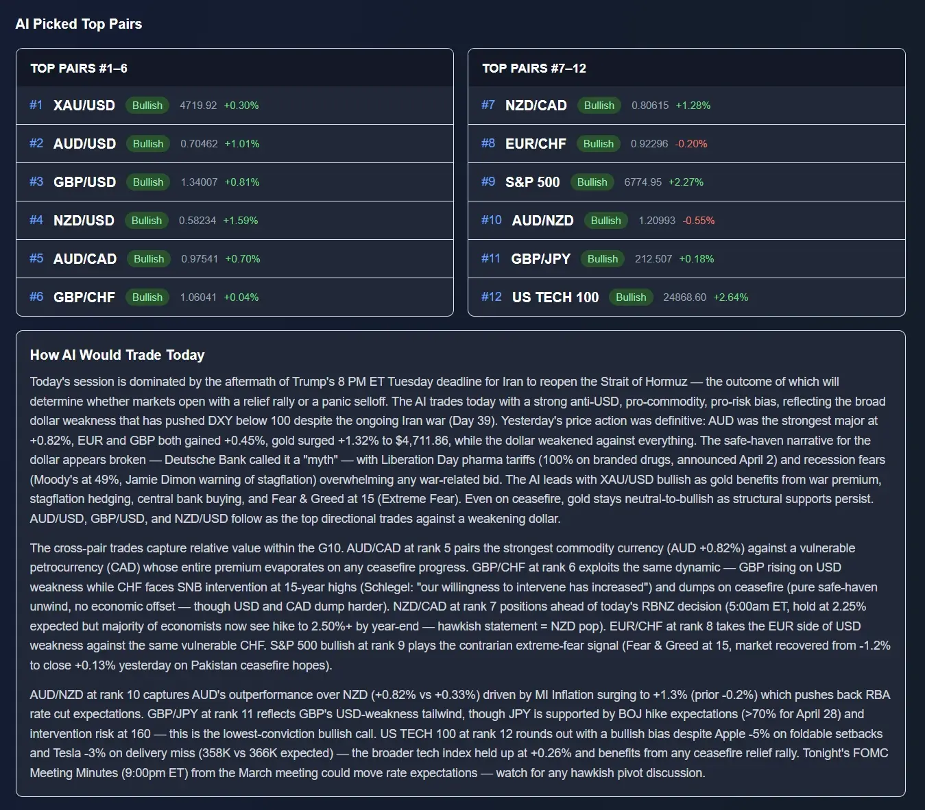
For completeness on what else is in there: 12 currency and instrument cards carrying a bias, a placement and written reasoning; a long-form Professional Analysis section; and live prices across 32 instruments. It publishes Monday to Friday between 20:00 and 23:00 UTC for the upcoming session, with no weekend edition. It is an in-app page rather than an emailed newsletter, and the full analysis sits on the Pro and Premium plans — free accounts see an admin-featured past-day preview, which is enough to judge the format before paying for it.
8. Where scores still fail, even built well
Suppose someone builds all seven inputs properly and applies an honest regime multiplier on top. There are still four things the number cannot do, and pretending otherwise is how people get hurt.
Unscheduled events do not appear on a calendar at all
A calendar scores what is on the calendar. An emergency statement, a leaked headline, a shipping lane closing at 03:00 — none of these have a row, and every one of them can dwarf the highest-scored scheduled release of the month. This is not fixable by better scoring. It is a structural limit of the format, and it is why a scenario list sitting alongside a calendar is more useful than a better calendar.
Clustering breaks the arithmetic
Two 6s landing thirty minutes apart on the same currency are not a 6. They may be worse than an 8, because the second print arrives into positioning that the first one just created, and liquidity has not recovered. Scores are computed per-event and the day is not a sum of its events. The most dangerous days on a calendar are frequently the ones with no single top-tier row and four medium ones stacked into the same two hours.
The tail is not the average
Every historical input is an average of a distribution, and your stop does not get hit by the average. It gets hit by the ninety-fifth percentile. An event with a modest typical move and a fat tail is a bigger threat to an account than a high-average, tight-distribution event, and a single-number score cannot express that at all. If a product ever gave you a dispersion band instead of a point estimate, it would be more useful and less marketable.
It does not know what you hold
A 9 on a NZD release is a 9 for someone trading NZD crosses and a 2 for everyone else. A 6 that hits four of the pairs you are currently long is more relevant to you than a 9 in a bloc you never touch. Impact is not just conditional on the regime — it is conditional on your book, and no published number knows your book.
What this adds up to. A well-built impact score is a triage tool for your attention. It tells you which four rows out of forty to actually think about tomorrow. It is not a position-sizing input, it is not a directional signal, and it is not a substitute for reading what the committee said. Any product that presents it as more than triage is selling the decimal point.
9. How to actually use a score
A short, unglamorous routine that gets most of the value out of any impact rating, good or bad.
- Filter first, on reach. Delete every row that does not touch an instrument you trade. On most days this removes eighty per cent of the calendar before you have thought about a single score.
- Apply the regime question to what survives. For each remaining row: what decision does this change, and when is that decision taken? Two rows will usually get promoted and two demoted relative to the printed tag.
- Check the consensus, not just the event. The number that moves price is the gap. An event with no published consensus is an event nobody can be surprised by in a measurable way.
- Look for clusters, not maxima. Scan for stacked releases in one window rather than the single highest row. The stack is where the spread blowouts happen.
- Decide your action before the release, not during it. Flatten, reduce, stand aside, or trade it — pick one in advance. Deciding at 13:29 is not a decision, it is a reflex.
- Grade the score afterwards. Note what the top-rated event of the week actually did. Four weeks of that and you will know whether your calendar’s ratings mean anything, which is more than most people can say about the tool they check every morning.
That last step is the one nobody does, and it is the only one that produces a real answer. Vendors will not publish their hit rate. You can measure it yourself in a spreadsheet with two columns, and after a month you will either trust the number or stop looking at it. Either outcome is an improvement on the current situation, which is checking a score every day and never once asking whether it was right.
For the pre-release checklist itself — consensus, timing, which pairs, what to do if it gaps — the Forex Factory calendar remains the retail baseline for expected-versus-actual at a glance, and it is free. Use it as the schedule. Do not use its folder colours as a score.
Frequently asked questions
What is an AI impact score on an economic calendar?
A single number, usually 1 to 10, claiming to summarise how much a scheduled release is likely to move markets. A well-built one blends the event’s historical average absolute move, how wrong consensus usually is on that series, how much of the move is retraced within the session, how many instruments it reaches, whether it is a policy decision or an input to one, revision risk, and how much is already priced. Most published scores are a rough blend of the first two, which is why they look identical from one month to the next.
Why is the high, medium, low impact rating not good enough?
Because three buckets force an enormous range of real outcomes into one label. An FOMC decision with a press conference and a preliminary consumer sentiment survey both routinely carry the top tag, and they are not comparable — one resets the rate path for every G10 pair and gold, the other frequently does nothing visible on a 15-minute chart. The tag is not wrong, it is too coarse to be a decision input. If two events share a colour but not an order of magnitude, the colour is not telling you anything you can size around.
What inputs should an economic event impact score use?
Seven earn their place. The historical average absolute move, measured in the instrument’s own volatility units rather than raw pips. Surprise dispersion — how far consensus typically misses on that series, because a series economists forecast accurately cannot surprise anyone. The retracement rate, meaning how much of the first move is given back before the close. Breadth of reach. Policy proximity: is this the decision itself, or an input the committee will read. Revision risk. And how much of the story is already in the forward curve before the print.
Why does the same economic event score differently on different dates?
Because impact is conditional on what the release can decide. A core CPI print landing while a central bank sits at terminal, says the bar for a move is high, and faces pricing that expects no change for six months can only nudge the path a year out. The identical release, with the identical consensus, into a committee that took two dissents last meeting and whose chair named core services as the trigger, decides whether the next meeting delivers a move at all. Nothing about the data changed. Everything about what it decides did.
How do I sanity-check a vendor’s impact score?
Six checks. Does the score for one event ever change between months, or is it a lookup table? Does it name the affected instruments, or just the currency? Does it distinguish the decision from the inputs to the decision? Does it say anything about how quickly the move fades? Does it acknowledge what is already priced? And does it tell you what it is conditional on? A score that fails all six is a repackaged high/medium/low tag with a decimal point added, and the decimal point is doing marketing work rather than analytical work.
Which economic events move which currency pairs?
Reach is what most separates a genuinely high-impact event from a merely loud one. FOMC decisions and US CPI reach every USD pair plus gold and the major indices, because they reprice the curve the world discounts off. ECB and Bank of England decisions reach their own crosses and domestic bonds, spilling wider only through risk sentiment. Country-specific inflation and employment prints reach that currency’s crosses and stop. A regional survey may reach one pair for twenty minutes. A score without a reach list is hiding the difference between an event that moves your book and one that moves someone else’s.
Does revision risk really belong in an impact score?
Yes, and almost everyone omits it. Some headline series are provisional by design: the US establishment survey revises its initial monthly payroll estimate twice in the two months that follow, as more of the sample reports, and is separately re-anchored each year to a near-complete count from unemployment insurance tax records. That is documented method, not a criticism. But it means the first print is an estimate that will be rewritten, which changes how much conviction it deserves and how durable the resulting move tends to be.
Does ChartSnipe publish a 1-to-10 impact score?
No, deliberately. The economic calendar widget on the News Impact page uses Low, Medium and High impact levels with a “How to Use” explainer, which is the honest resolution for a scheduled-event list. The conditional work sits in the Risk Analysis output: each scenario carries a severity of High, Medium or Low, plus the specific trigger, a written description of the expected impact, and tags naming the affected pairs. Because it is rebuilt each session, the same underlying event can carry a different severity from one week to the next.
Sources & further reading
- → BLS — nonfarm payroll revisions between over-the-month estimates, 1979 to present — the primary record of how far first prints get rewritten, and the basis for the revision-risk input.
- → BLS — “Why are there revisions to the jobs numbers?” — the agency’s own explanation of the two monthly revisions and the annual benchmark to tax records.
- → BLS — Consumer Price Index frequently asked questions — methodology, basket construction and seasonal adjustment, all of which sit behind the headline number nobody reads the footnotes on.
- → Federal Reserve — FOMC calendars, statements, minutes and projections — where the US regime term is announced, usually inside a clause rather than a headline.
- → European Central Bank — monetary policy statements and press conference transcripts — the Q&A is where the euro-area regime shift usually becomes visible.
- → Trading Economics — economic calendar — consensus alongside the full historical series, which is what you need to build surprise dispersion by hand.
- → Forex Factory — calendar — the retail baseline for the three-colour impact tag this article is arguing with.
See a conditional score instead of a static one
News Impact ships a calendar widget with Low, Medium and High impact levels, and a Risk Analysis section where each scenario carries a severity, the trigger that would fire it, the expected impact and the pairs it reaches — rebuilt for every session, which is why the same event can score differently from one week to the next. Published Monday to Friday between 20:00 and 23:00 UTC for the upcoming session.