
How AI Reads Financial News
Not “it scans the headlines and decides.” The actual pipeline, stage by stage — ingestion, dedupe, entity extraction, classification, the surprise calculation, cross-asset mapping and conflict resolution — and the one distinction that separates a useful system from an expensive random number generator.
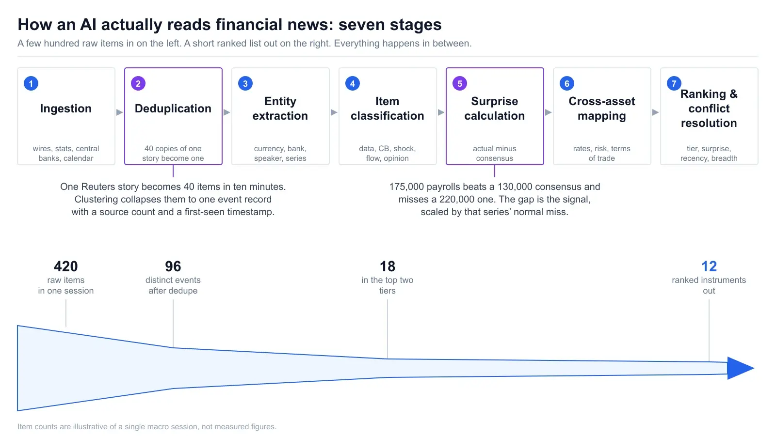
Most explanations of AI news analysis stop at the word “sentiment.” The system reads the news, decides whether it feels positive or negative, and trades accordingly. That description is both extremely popular and almost entirely wrong, and it is the reason a whole generation of retail news bots lost money in a way their builders found genuinely confusing.
Here is the problem in one line: positive tone is not positive price. A headline can be written in unambiguously grim language and still be bullish for the currency it names. It can be glowing and mean nothing at all, because everyone already knew. Reading the news is a language problem. Working out what it does to a price is a market-structure problem. They are not the same problem and they do not have the same answer.
This is a walkthrough of the actual mechanism — seven stages from a wire feed to a ranked output, what each one is really doing, and where each one breaks. If you want the calendar itself explained, we cover that in how to read an economic calendar. This post is strictly about the reading.
Key Takeaways
- →Sentiment scoring and impact scoring are different problems. Conflating them is the single most expensive mistake in automated news trading.
- →Deduplication comes first for a reason: the same wire story arrives twenty times, and counting reprints turns volume into a fake importance signal.
- →The tradable number is actual minus consensus, scaled by how noisy the series normally is. The headline value on its own is not information.
- →Events reach instruments through transmission channels — rate expectations, growth, risk appetite, terms of trade. It is a graph, not a lookup table.
- →A revision to the previous two months can cancel a headline beat entirely. Systems that read only the top line miss this constantly.
- →A model with no live market data cannot tell you what is already in the price. That limitation is real and no amount of model size fixes it.
1. Ingestion and deduplication
The input is messier than people expect. A macro pipeline is pulling from at least five structurally different kinds of source, and almost none of them arrive in the same shape.
- Wire copy. Reuters, Bloomberg, AFP and the outlets that republish them. Short, fast, frequently updated in place.
- Official statistical releases. The BLS Employment Situation and CPI releases, Eurostat flash estimates, ONS bulletins. Structured tables wrapped in prose, published to a fixed schedule.
- Central bank output. Statements, minutes, projections and the transcripts of press conferences from the Federal Reserve and the ECB. Long, deliberately careful, and the place where a single changed adjective is the whole story.
- Calendar data. Scheduled events with a consensus attached, from sources like Trading Economics. This is the only stream that tells you what the market expected.
- Unscheduled geopolitical headlines. No consensus, no schedule, no structure. Arrive whenever.
Then comes the stage everyone skips in the explainer and nobody skips in the build: deduplication. One Reuters markets story becomes forty items within ten minutes. Aggregators republish it. Regional outlets rewrite the first paragraph. Newsletters summarise it. A wire service updates the same story four times as details firm up, and depending on your feed you receive all four versions as separate records.
Why this matters more than it sounds. If a system counts each copy as an independent signal, article volume silently becomes a proxy for importance. The result is a pipeline that reliably ranks whatever is most republished — usually the most dramatic geopolitical headline — above the scheduled data release that will actually move the pair. You have not built a news analyser. You have built a popularity contest with a finance skin on it.
Dedupe works by clustering: near-identical text collapses to one event record with a source count and a first-seen timestamp attached. Both of those survive as features. Source count is a weak but real signal of how widely a story is being watched. First-seen timestamp matters because a story that broke six hours ago has already been traded, and a story that broke ninety seconds ago has not.
One subtlety worth naming: update and duplicate look identical to a naive text-similarity check. “Fed holds rates” and “Fed holds rates, Powell flags upside inflation risk” are 90% the same string and completely different items. Good clustering keeps the latest and richest version of a developing story rather than the first one it saw.
2. Entity extraction — what is this actually about?
Now each surviving item needs to be pinned to things that trade. The extraction is looking for a specific set of entity types, and the list is shorter than a general-purpose NLP system would use because most of what appears in financial text is irrelevant to a forex or index trader.
| Entity type | Examples | What it unlocks |
|---|---|---|
| Currency / economy | USD, EUR, JPY, AUD | Which side of which pairs is affected |
| Central bank | Fed, ECB, BoE, BoJ, RBA, RBNZ | Whose policy path is in question |
| Speaker and voting status | Chair, voting member, non-voter | Whether the comment carries weight |
| Data series | CPI, non-farm payrolls, PMI, GDP | Which consensus to compare against |
| Instrument | XAU/USD, S&P 500, WTI, US 10Y | Direct price mapping |
| Time reference | “last month”, “by year-end”, “in Q3” | Whether this is news or history |
The entity that trips up more systems than any other is the speaker. “Fed official warns on inflation” means something very different depending on whether the official is the Chair speaking on the record after a decision, a voting regional president, or a non-voting president giving a lunch address in a year when they have no vote. All three produce nearly identical headline text. Only one of them is worth repricing anything for, and the difference is not in the sentence — it is in a rotation schedule the model has to know about separately.
The second is time reference. A large fraction of financial text describes things that already happened. “The euro fell 0.4% after Tuesday’s inflation print” is a report, not a forecast, and a system that scores it as fresh bearish EUR input is double-counting an event it already processed on Tuesday. Distinguishing new information from narration of old information is unglamorous and it removes a surprising amount of noise.
Extraction also has to handle the case of no relevant entity at all, which is most items. A quarterly earnings story about a mid-cap software company is real financial news and has no bearing on GBP/USD. Dropping it cleanly is as much a part of the job as tagging the ones that matter.
3. Classifying the item type
Different kinds of news need different handling, so the next gate sorts each item into a type. This is not cosmetic. The type determines which downstream logic runs at all.
Scheduled data release
Has a consensus, a prior, a fixed release time and usually revisions. The surprise calculation in stage 4 applies. Highest signal-to-noise of any category, because you know in advance both when it lands and what was expected.
Central bank decision or communication
The decision itself is often fully priced; the language is the event. What matters is the delta against the previous statement — which words were added, removed or softened — plus the dissent count and any change to projections. This is text comparison, not sentiment.
Geopolitical or shock headline
No consensus exists, so there is nothing to compute a surprise against. These are handled as risk-appetite events and scenario branches rather than point estimates: severity, trigger, and what happens to each affected instrument if it escalates or resolves.
Positioning and flow story
“Speculators cut net short yen positions to a six-month low.” Not directional on its own — it is context about how crowded a trade is, which changes how violently the market reacts to the next real event. Treating this as a signal rather than a modifier is a common error.
Analysis, opinion and narration
A bank note, a strategist quote, a market wrap. Occasionally moves things when it is a major house changing a formal forecast. Usually it is a restatement of what already happened, and its main value is as a read on prevailing consensus rather than as new information.
The classification also feeds a tier, and the tiering is closer to what an experienced trader does than to anything statistical. A rate decision outranks a first-tier data release, which outranks second-tier data, which outranks a speech by a non-voter, which outranks a market wrap. We break down which scheduled events actually deserve the top tier in high-impact forex news events.
A press conference is the hardest input in the set
It is worth seeing what an unstructured source actually looks like before assuming a pipeline can parse it trivially. An FOMC press conference is roughly an hour of live speech: a prepared statement read aloud, then unscripted answers to journalists, in which the Chair is deliberately trying not to commit to anything. There is no consensus number to compare against. The tradable content is often a single qualifier — whether policy is described as “restrictive” or “somewhat restrictive” — buried thirty minutes into a Q&A.
“FOMC Press Conference, July 29, 2026” — an hour of unscripted speech with no consensus attached. This is the raw material a pipeline has to turn into a directional read.
The realistic approach is not to score the tone of the transcript. It is to diff the prepared statement against the previous one, extract every explicit conditional the speaker gives (“if inflation continues to…”), and record which of those conditions the incoming data is currently satisfying. That is a much narrower task and a much more honest one.
4. The surprise calculation
For anything that had a consensus, this is the stage that produces the number that actually matters. And the number is not the headline value. It is actual minus consensus.
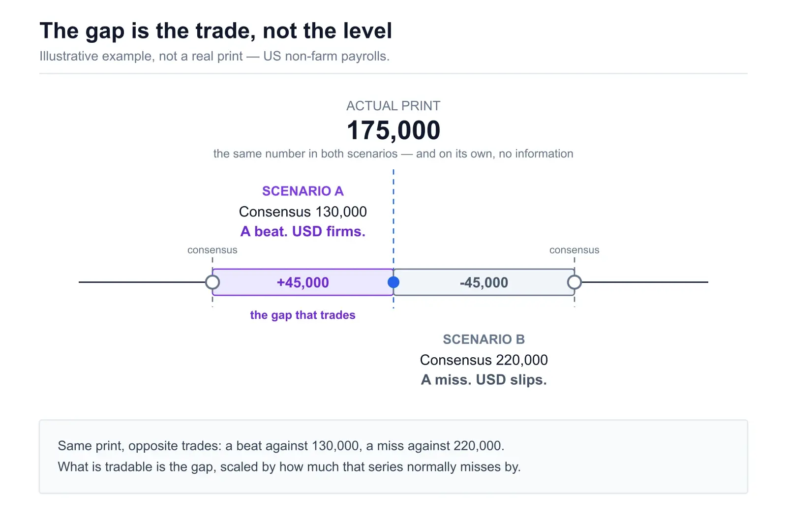
A non-farm payrolls print of 175,000 is neither strong nor weak in isolation. Against a 130,000 consensus it is a solid beat and USD-positive. Against a 220,000 consensus it is a clear miss and USD-negative. Same number, opposite trade. The market spent the previous week pricing the expectation; the only thing left to trade at 8:30am Eastern is the distance between the guess and the print.
A raw surprise is still not quite enough, because series have wildly different noise levels. A 45,000 miss on payrolls is ordinary — that series routinely misses by that much and gets revised by more. A 0.3 percentage point miss on core CPI is enormous, because core CPI almost never surprises by that much. So the useful form is a standardised surprise: the gap divided by the typical size of that series’ surprises. That is exactly what the well-known economic surprise indices do, and it is the reason they are comparable across countries and data types.
| Release | Typical miss | What counts as a shock |
|---|---|---|
| US non-farm payrolls | Tens of thousands | A six-figure gap, or large revisions to the prior two months |
| US core CPI (m/m) | Around 0.1pp | 0.2pp or more — this series is tightly forecast |
| Flash PMI | A point or two | Crossing the 50 line unexpectedly |
| Rate decision | Zero — usually fully priced | Any deviation at all, plus dissents and projection changes |
The revision trap
This one deserves its own heading because it catches humans as often as machines. Most major statistical releases revise their own history. The BLS publishes revisions to the previous two months of payrolls alongside every new print. A headline that beats consensus by 40,000 while the previous two months are revised down by a combined 90,000 is, in net employment terms, a miss dressed as a beat.
Markets frequently take fifteen to thirty seconds to work this out, which is exactly long enough for an initial move in the wrong direction followed by a full reversal. A pipeline that reads only the headline field will confidently score the first move and be wrong. A pipeline that parses the revision lines out of the release text will not. This is a parsing problem masquerading as an analysis problem, and it is the single most reliable place where careful extraction beats a clever model.
Headline versus core
The same discipline applies to composition. Headline CPI includes food and energy and therefore swings on oil. Core strips them out and is what policy actually responds to. An inflation print where headline surprises high purely because of petrol prices, while core comes in exactly as forecast, is close to a non-event for rate expectations — and yet it produces the most dramatic headlines of the day. Reading which component drove the number is not optional.
5. Sentiment scoring is not impact scoring
This is the section that matters. Everything above is plumbing; this is where systems either work or quietly bleed.
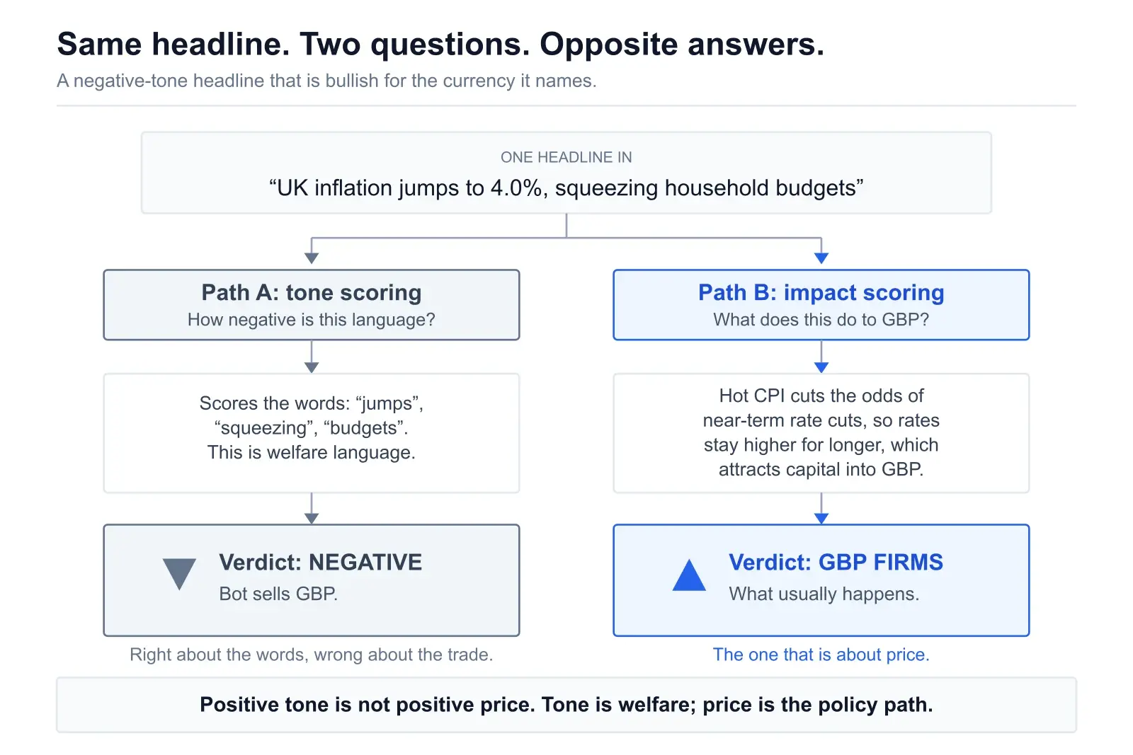
Sentiment scoring asks: how negative or positive is this language? It is a well-defined problem, models are good at it, and it has been solved to a reasonable standard for years. Impact scoring asks: what does this item do to the price of a specific instrument, in which direction, how large, over what horizon, and how much of it is already in the price? That is a completely different question, and the answer routinely has the opposite sign to the sentiment score.
Case 1: negative tone, bullish currency
“UK inflation jumps to 4.0%, squeezing household budgets.” Every sentiment model on earth scores this negative, and reasonably so — it describes people being worse off. The currency effect is usually the opposite. A hot inflation print reduces the odds of near-term rate cuts and raises the odds of holding higher for longer. Higher expected rates attract capital. GBP tends to firm.
The tone is about welfare. The price is about the policy path. These come apart constantly, and it is not an edge case — inflation data is one of the two most traded macro categories there is.
Case 2: positive tone, bearish asset
The mirror image is the “good news is bad news” regime that shows up whenever the market is worried about tightening. A genuinely strong labour market print reads as unambiguously good and can send equity indices down, because it pushes out the expected timing of cuts and lifts the discount rate. Meanwhile the same print is bullish for the dollar. One item, positive tone, opposite signs on two different instruments — and neither sign is the sentiment score.
Case 3: strongly-toned and worth exactly nothing
This is the quiet one. A central bank delivers the rate cut that interest rate futures had priced at 95% for a month. The headline is dramatic. The tone is emphatic. The price reaction to the cut itself is close to zero, because the cut was in the price weeks ago. What actually moves is any change in the guidance, the vote split, or the projections — the parts of the release nobody puts in the headline.
A sentiment score has no way to represent this. It will return a strong reading on a fully-anticipated event and an identical reading on a genuine shock, because the language is the same in both cases. Expectation is not a property of the text.
What an impact score has to carry that a sentiment score does not. Direction per instrument, not a global polarity. Magnitude, scaled against the normal volatility of that instrument. Horizon — minutes, the session, or a structural repricing. Conviction, which should collapse when the evidence conflicts. And a priced-in estimate, which cannot come from text at all. Five fields where a sentiment model has one, and four of the five require information that is not in the sentence.
Why naive news bots lose money
Put the three cases together and the failure is obvious in hindsight. A bot wired as negative sentiment equals short the currency will sell GBP into a hot UK inflation print, sell the dollar into a strong jobs report because the equity commentary around it was gloomy, and trade a fully-priced ECB cut as though it were news. It will do this quickly, consistently, and with excellent uptime.
The losses do not come from the model being bad at reading. They come from the model being asked the wrong question. That is worth sitting with, because the instinct when a news system underperforms is to reach for a better language model — and a better language model produces a more accurate answer to the same wrong question.
If you want the practical trading side of this — how to actually position around the releases where these effects are largest — that is covered in how to trade NFP, CPI and FOMC.
6. Cross-asset mapping through transmission channels
Once an item has a type, a surprise and a set of entities, it has to reach instruments. This is not a lookup table of “event X moves pair Y.” It is a routing problem through a small number of channels, and the same event usually travels down several of them at once with different signs.
Rate expectations
The dominant channel in FX. Data changes the implied policy path, the path changes the interest rate differential, and the differential moves the pair. Anything that touches inflation, employment or growth in a major economy routes here first.
Risk appetite
Geopolitical shocks, credit events, sharp equity moves. Pushes JPY and CHF up and AUD and NZD down more or less mechanically, and the dollar in whichever direction the market currently believes it belongs — which is not always the safe-haven one.
Terms of trade
Commodity prices moving the currencies of exporters and importers in opposite directions. CAD and NOK against oil, AUD against iron ore, JPY as a large energy importer on the wrong side of an oil spike.
Fiscal and political risk premium
Elections, budget disputes, sovereign rating actions, tariff announcements. Slower-moving, occasionally violent, and the channel where a currency can weaken despite rising yields — which is the tell that the market is charging a risk premium rather than rewarding carry.
Intervention and policy risk
Verbal or actual FX intervention, capital controls, yield curve policy. Asymmetric by design: it caps a move in one direction without meaningfully changing the underlying fundamentals.
Take an oil supply shock and route it properly. Terms of trade: bullish CAD, bullish NOK, bearish JPY. Inflation: raises headline CPI everywhere, which routes back into rate expectations with a lag. Growth: an energy tax on consumers, which is bearish for growth and therefore eventually dovish. Risk appetite: bearish equities, bullish gold. The net effect on any given pair depends on which channels dominate over which horizon — and CAD/JPY, which sits on the same side of two of those channels, moves far more than either currency does against the dollar.
The honest caveat about channels. These relationships are stable enough to be useful and not stable enough to be laws. The dollar behaves as a safe haven in most risk-off events and has repeatedly failed to in others, particularly when the United States is itself the source of the shock. Correlations that held for three years break in a week. A system that treats the channel map as fixed will be confidently wrong at exactly the moments the map changes, which are also the moments the moves are largest.
7. Ranking and conflict resolution
By this point there are dozens of scored items, many of them touching the same instruments, plenty of them disagreeing. The output has to be short and ordered, so something has to decide what wins.
Ranking combines four things: the tier from stage 3, the standardised surprise from stage 4, a recency decay so a nine-hour-old story does not outrank something from twenty minutes ago, and a breadth term for how many instruments the item touches. A single-country second-tier release that only affects one pair does not belong above a Fed decision, even if its surprise was larger in standardised terms.
When two items point opposite ways
The first question is whether they act through the same channel or different ones, because that changes everything.
- Same channel, opposite signs. A hot CPI print and a weak retail sales print both act on rate expectations. They genuinely net out, and the correct output is a smaller net signal with lower conviction — not a coin flip between them.
- Different channels, opposite signs. A hawkish central bank (rate expectations, currency-positive) landing during a risk-off geopolitical event (risk appetite, currency-negative if it is a risk currency). These do not net out. They dominate at different horizons and against different counterparts, which is exactly why a currency can be up against one pair and down against another on the same day.
- Scheduled versus unscheduled. A live geopolitical escalation generally overrides scheduled data, because it changes the regime the data is being read in. This is the one place where a simple override rule is more honest than a weighted average.
The output that matters here is not the direction. It is the conviction. A system that resolves every conflict into a confident call is not resolving conflicts, it is hiding them. When the evidence is genuinely split, the useful answer is “split, and here is what would break the tie” — which is why scenario output beats point-forecast output for anything unscheduled.
It is also why an AI reading of a calendar is a different product from the calendar itself. We go into what that layer adds, and where it is oversold, in AI economic calendar analysis.
8. Where it honestly breaks
Every stage above has a corresponding way to be wrong. These four are the ones that cost real money, and none of them are solved by a larger model.
1. Already-priced news
The biggest one, and structurally unfixable from text alone. Expectation lives in the price, not in the sentence. The only way to estimate what is priced is external evidence: interest rate futures and swap pricing for policy, the drift in the pair over the preceding sessions, options skew, and speculative positioning data. A pure text pipeline with no market feed is reading the news the way someone who just woke up reads it — accurately, and eight hours late.
2. The tone-versus-direction trap
Covered at length above, and worth restating because it is so persistent. Tone describes how the writer feels about the world. Direction describes what a specific instrument does. The correlation between the two is weak, unstable, and negative in the entire inflation category.
3. Headline versus revision, and headline versus core
Both are extraction failures rather than reasoning failures. If the pipeline reads only the top-line field, it will miss the downward revision that cancels the beat and the energy component that explains the whole surprise. The fix is unglamorous parsing of the full release text rather than the summary field a data vendor exposes.
4. Regime blindness
The same data point means different things in different regimes. Strong employment is currency-positive when the market is worried about inflation and can be barely relevant when the market has moved on to worrying about credit. A model trained or prompted on one regime will apply its map to another without noticing. The tell is a system whose reasoning stays confident while its accuracy quietly degrades.
A useful test for any news AI you are evaluating. Find a day where a data release beat consensus and the currency fell. Ask the system to explain it. A tone-based system will either contradict itself or claim the market was irrational. A system doing real impact scoring will point at the revision, the component mix, or the positioning — something specific and checkable. The explanation is the audit.
9. What impact scoring looks like when it reaches the screen
All of the above is abstract until you see the output format, and the format is where you can tell which question a system was answering. ChartSnipe’s published methodology states it plainly:
“Our AI scans and synthesizes global financial news, official statements, central bank speeches, and economic calendar events to identify the highest-impact factors moving markets. Sources are attributed inline where applicable. This is AI-generated analysis for informational and educational purposes only — not financial advice.”
Note what that sentence commits to and what it does not. It commits to identifying the highest-impact factors. It does not claim to score the mood of the news. The News Impact page publishes on trading days only, Monday to Friday between 20:00 and 23:00 UTC, for the upcoming session. Full analysis is a Pro or Premium feature; free accounts see an admin-featured past-day preview rather than the live output.
Risk Analysis: scenarios, not scores
The Risk Analysis block is the clearest example of the distinction in this whole article. Each row is a scenario with a severity of High, Medium or Low, an explicit trigger, a described impact, and the affected instruments listed as tags. That is the shape an unscheduled, no-consensus event has to take — a conditional branch, not a sentiment reading.
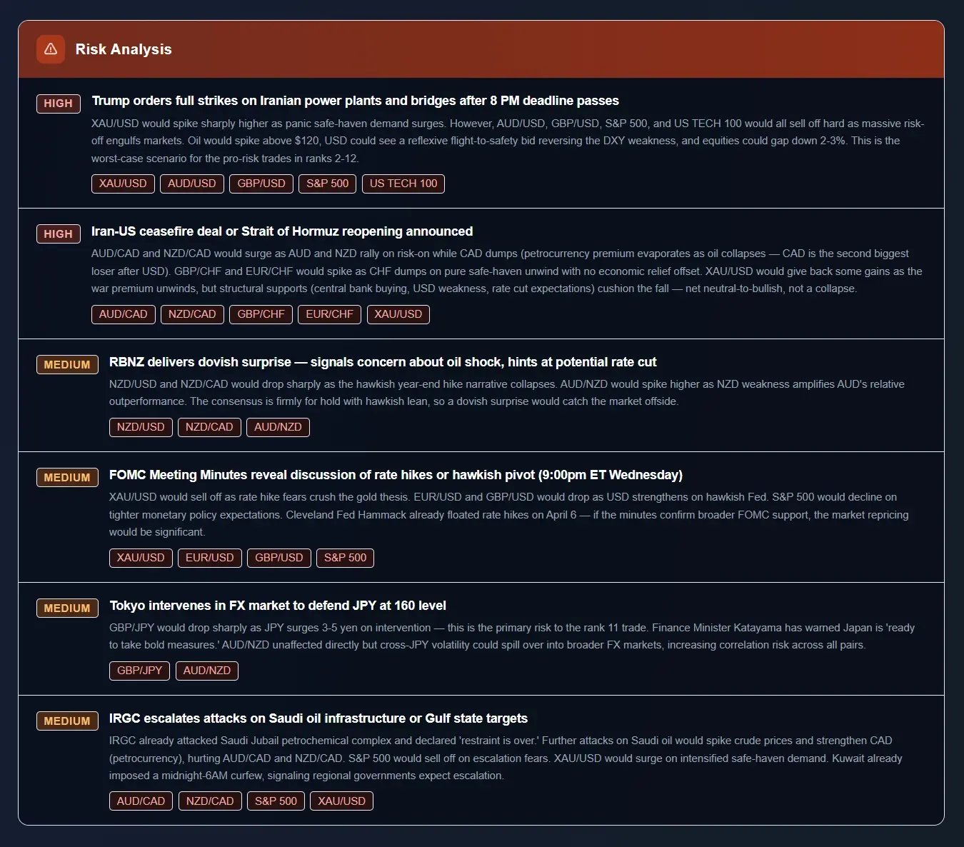
That second scenario in the screenshot is a textbook priced-in note as well: “consensus is firmly for hold with hawkish lean, so a dovish surprise would catch the market offside.” The scenario is doing exactly what stage 4 describes — positioning the possible outcome against what is expected rather than describing it in isolation.
Ranked pairs and the trade summary
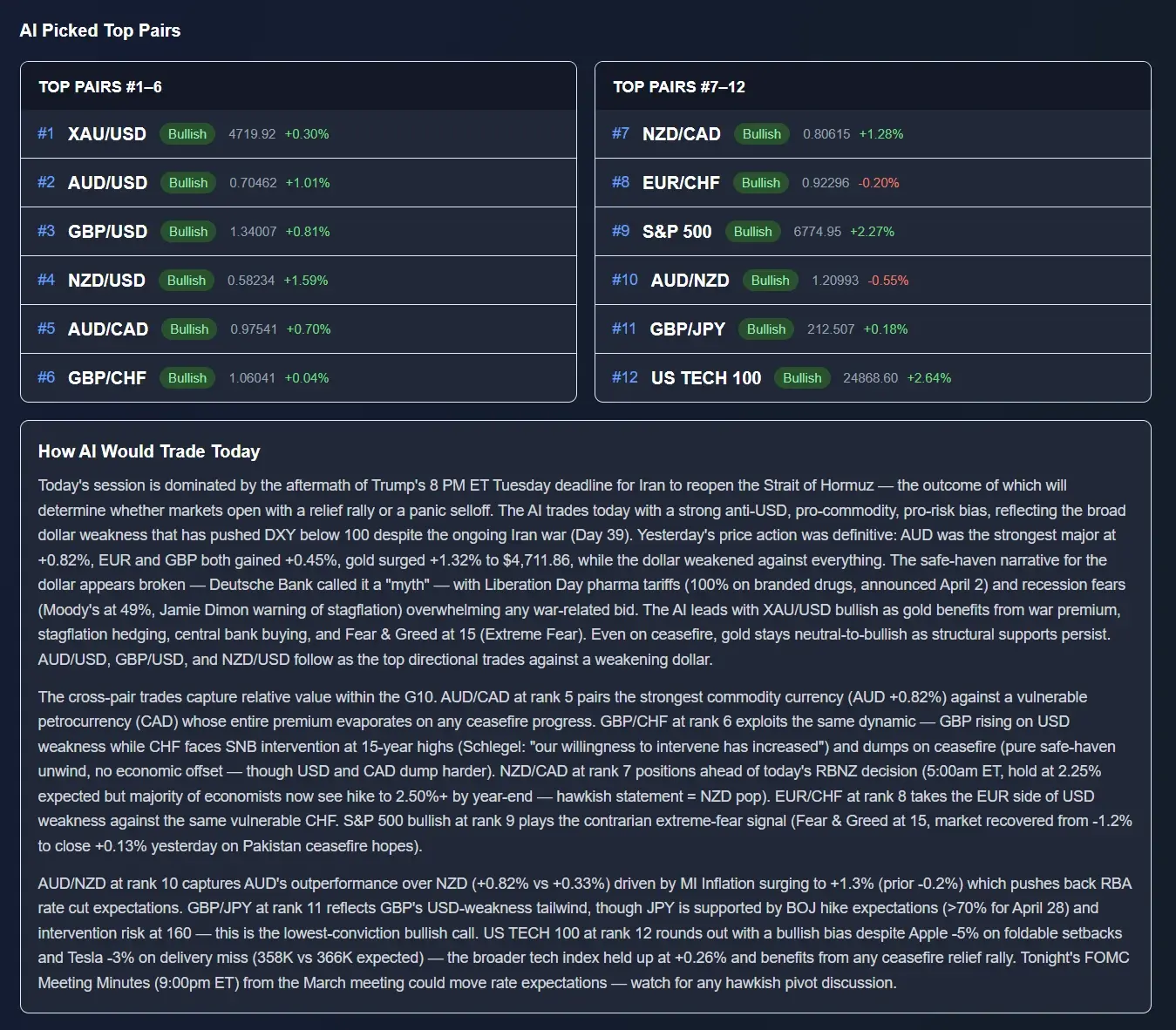
Stage 7 — ranking and conflict resolution — surfaces as an ordered list of 12 instruments with a bullish or bearish bias, the live price and the daily percentage move, followed by a “How AI Would Trade Today” summary that has to explain why the ordering is what it is.
The long-form section is where the channels show
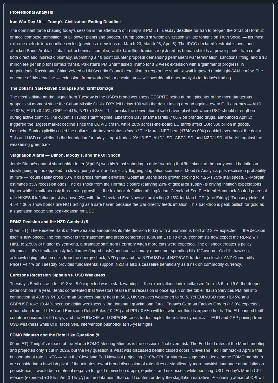
The Professional Analysis block is the transmission mapping from stage 6 written out. It is organised by theme rather than by headline — a geopolitical driver, a currency-specific policy question, a rate decision preview — and each theme carries the surprise figures and the channel it is acting through.
Alongside these sit 12 currency and instrument cards with a bias, a placement note and the reasoning behind each, an economic calendar widget, and live prices across 32 instruments. If your interest is the chart rather than the macro, the Chart Snipe tool is the other half: upload a screenshot, get pattern, trend, probability and entry with risk guidance.
One thing worth saying plainly, since this article has been sceptical throughout: none of this removes the priced-in problem. An analysis published the evening before a session is a read on what is known then, and the market will have moved on some of it by the open. The right way to use any news analysis — ours included — is as a map of what is in play and what would change the picture, not as a set of instructions.
Frequently asked questions
How does AI read financial news for trading?
In stages, not in one step. The pipeline ingests wire copy, central bank releases, official statistics and calendar data; deduplicates it, because the same wire story arrives dozens of times; extracts entities (currency, instrument, central bank, speaker); classifies the item type; computes the surprise where a consensus exists; maps that surprise through transmission channels to specific instruments; then ranks everything and resolves conflicts. The language model does the reading and the mapping. The scoring is a separate problem from the reading.
What is the difference between sentiment scoring and impact scoring?
Sentiment scoring asks how negative or positive the language is. Impact scoring asks what the item does to the price of a specific instrument, in which direction, how large, and how much is already priced. They frequently give opposite answers. A hot inflation print is written in grim language and is usually bullish for that currency, because it raises the odds of tighter policy. Naive news bots lose money mostly because they treat tone as direction.
Why is actual versus consensus more important than the headline number?
Because the market already traded the expectation. A payrolls print of 175,000 is a beat against a 130,000 consensus and a miss against a 220,000 consensus — same number, opposite trade. The tradable quantity is the gap between actual and consensus, ideally scaled by how noisy that series usually is. Scoring the raw headline value means scoring the wrong number.
Can AI tell whether news is already priced in?
Only partially, and only with live market data. Text alone cannot tell you what is in the price. Positioning has to be inferred from rate futures and swap pricing, the drift over the preceding sessions, options skew and speculative positioning data. A model reading text with no market feed cannot separate a genuine shock from something the market spent two weeks preparing for. That is the single largest limitation of text-based news analysis and it deserves stating plainly.
What is deduplication and why does it matter?
One wire story is republished, summarised and aggregated across dozens of outlets within minutes. If a system counts each copy as an independent signal, article volume becomes a proxy for importance and the loudest story wins regardless of whether it matters. Deduplication clusters near-identical items back to one event with a source count, so twenty reprints of the same comment do not outrank one genuinely new data release.
What are the main failure modes of AI news analysis?
Four dominate. Already-priced news, where the event happens exactly as expected and nothing moves. The tone-versus-direction trap. Headline-versus-revision confusion, where a payrolls beat is cancelled by downward revisions to the previous two months. And the absence of live positioning data. None of these are fixed by a bigger model — a better model just answers the wrong question more fluently.
How does AI map a news event to specific currency pairs?
Through transmission channels rather than direct association: rate expectations, growth, risk appetite, terms of trade, and fiscal or political risk premia. An oil shock is bullish CAD and NOK through terms of trade, bearish JPY through the import bill, and inflationary everywhere, which feeds back into rate expectations with a lag. The mapping is a graph, not a lookup table, and the same event can carry opposite signs down different branches.
What happens when two news stories point in opposite directions?
The first question is whether they act through the same channel. Two items on the same channel net out into a smaller signal with lower conviction. Two on different channels can both be true at once, which is why a currency can rally against one counterpart and fall against another on the same day. Live geopolitical escalation generally overrides scheduled data because it changes the regime. If the conflict cannot be resolved, the honest output is lower conviction, not a forced direction.
Sources & further reading
Primary sources are the ones worth reading directly — a pipeline that only ever sees the wire summary of a release is missing the revisions and the component detail that decide half the cases in this article.
- US Bureau of Labor Statistics — Employment SituationThe payrolls release in full, including the revision paragraph that the headline number never shows.
- Federal Reserve — FOMC calendars, statements and minutesStatements are archived side by side, which makes the statement-diff exercise in stage 3 something you can do by hand.
- European Central Bank — monetary policy press conferencesFull transcripts including the Q&A, where most of the tradable content actually sits.
- Trading Economics — economic calendarConsensus, prior and actual in one place, which is the raw material for any surprise calculation.
- Reuters MarketsThe wire that most of what you read elsewhere is a reprint of — useful for seeing the deduplication problem from the source end.
See what impact scoring looks like as output
ChartSnipe publishes News Impact analysis on trading days between 20:00 and 23:00 UTC for the session ahead: 12 ranked instruments with bias and live price, Risk Analysis scenarios with severity, trigger, impact and affected pairs, currency and instrument cards, and a long-form professional read. Full analysis is a Pro or Premium feature.