12 Signs the Market Is About to Reverse
The twelve signals that reliably precede a trend reversal — what each one looks like on the chart, why it works psychologically, and the confirmation rule that keeps you out of false positives.
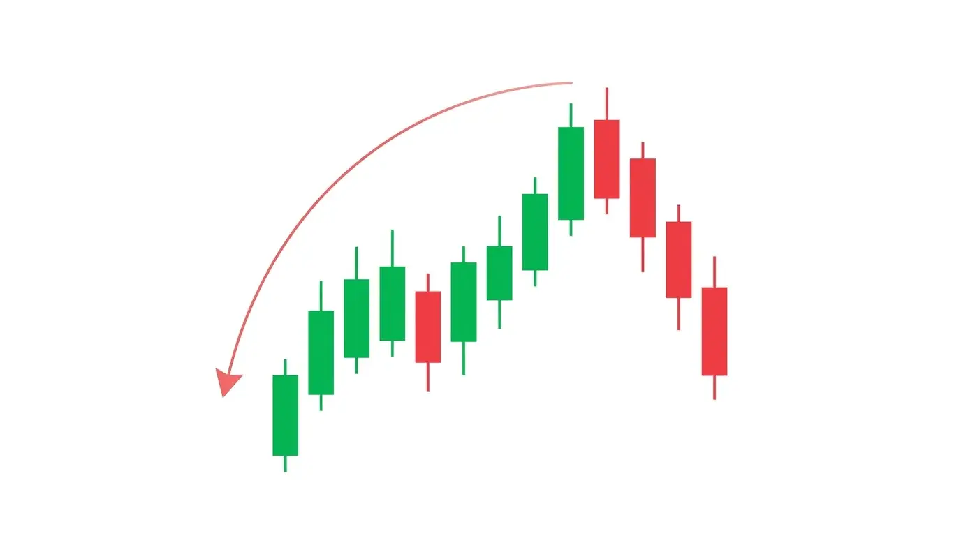
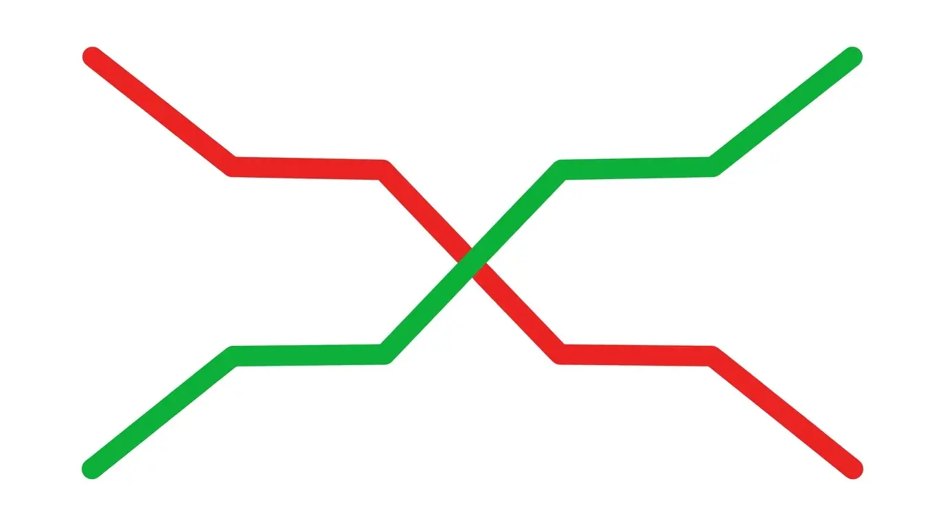
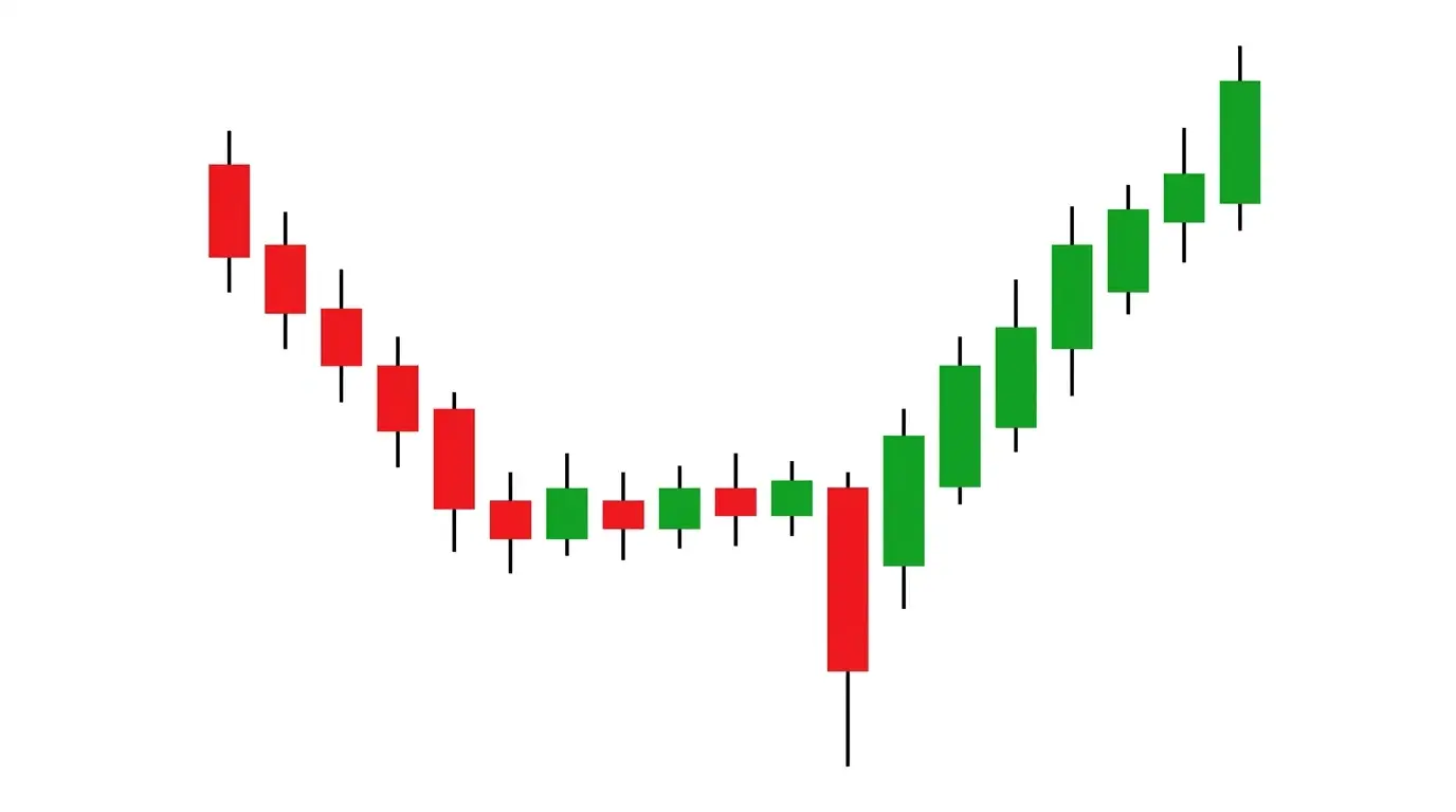
Every trader has been told some version of "the trend is your friend." It is good advice right up until the moment it stops being true, and the moment it stops being true is usually exactly when the crowd finally agrees the trend will never end. Reversals do not arrive as a single, obvious signal. They arrive as a cluster of small disagreements — between price and momentum, between volume and range, between the asset and its macro drivers — that pile on top of each other until the existing trend simply cannot hold.
That is the real insight behind reversal trading. No single sign is enough. RSI divergence on its own fails all the time during strong trends. A volume climax by itself can be a continuation spike into a breakout. A failed breakout in isolation is just chop. But when three or four of these signals show up together inside the same session — RSI divergence plus a climax bar plus a failed breakout plus an exhaustion candle — you are no longer guessing. You are looking at a high-probability setup that the prevailing order flow has run out of real buyers (or sellers).
This is the ChartSnipe field guide to those signals. Twelve of them, ranked roughly from most common to most situational. For each one you get a plain description of what it looks like on the chart, the psychology that makes it work, the classic false positive that costs traders money, and a simple confirmation rule to stack on top of it.
Key Takeaways
- →No single reversal signal is reliable on its own — always wait for a cluster of at least two or three before you act against the prevailing trend.
- →Price-vs-momentum disagreements (RSI divergence, MACD flattening) are leading; price-vs-volume disagreements (climax bars, drying liquidity) are confirming.
- →Failed breakouts and liquidity grabs above equal highs are the fastest, cleanest reversal triggers because they run stops and then reverse on the same candle.
- →Parabolic blow-offs and sentiment flips are strategic reversal signs — they tell you the regime is ending but do not give you a precise entry.
- →Cross-asset divergence (DXY vs gold, VIX vs SPX, yields vs tech) often reverses BEFORE the chart in front of you does — always check a correlated market.
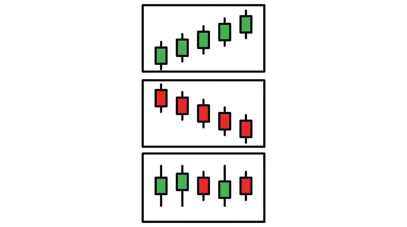
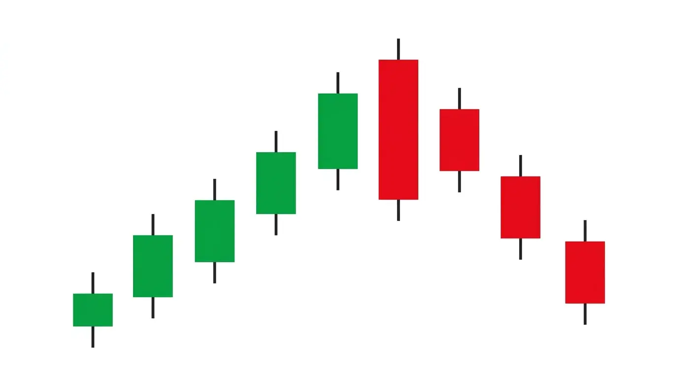
1. Bearish RSI Divergence at a Higher High
Price prints a fresh higher high but RSI prints a lower high. That disagreement is the textbook bearish divergence, and it shows up before almost every meaningful top in trending markets. What you are seeing is the second push — the one that looks the strongest to the eye — being driven by fewer and fewer participants with less and less intensity. The chart says "new high." The oscillator says "barely."
The psychology is straightforward. The first leg of a rally is driven by early institutional buyers. The second leg is driven by momentum funds and late retail chasing the move. By the time a third push arrives, the original buyers are already distributing into the late crowd — price keeps grinding up, but the rate of change is rolling over. RSI is a rate-of-change tool, so it registers the exhaustion before price does. That is why the divergence leads.
The classic false positive: divergence prints on a strong, healthy trend and price just keeps going. Trends can stay divergent for weeks. The confirmation rule is simple — do not act on RSI divergence alone. Wait for price to lose the most recent higher low, or stack the divergence with at least one other signal from this list (a climax bar, a failed breakout, a pin bar). Divergence is the warning; the break-of-structure is the trigger.
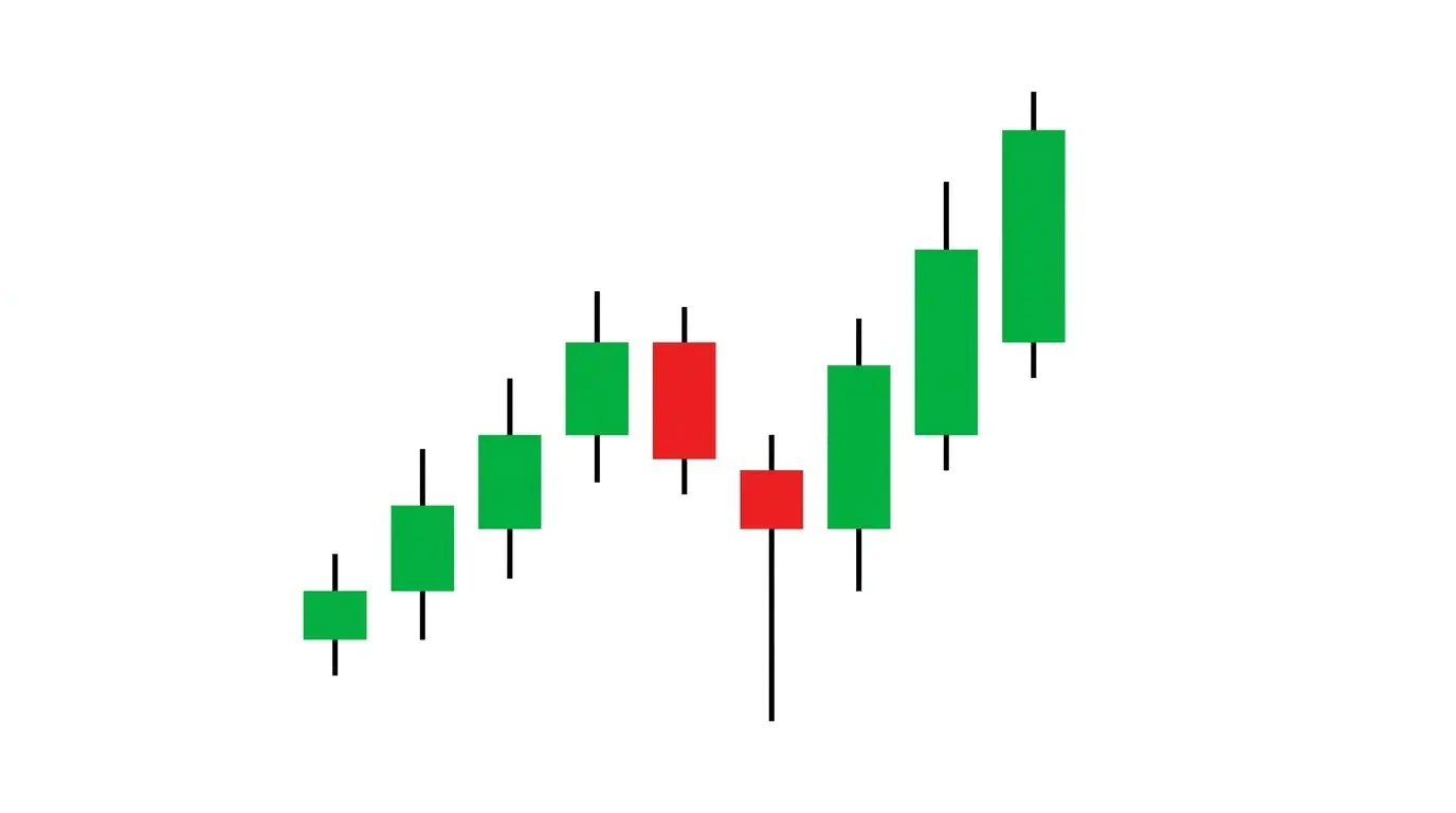
2. Volume Climax / Capitulation Spike
A single bar prints with five to ten times the average volume of the prior session. Range explodes. Wicks appear on both sides. The body closes well inside the range rather than at the extreme. That is a climax bar, and it is the footprint of a market that just ran out of willing participants in one direction. Buyers (or sellers) who were going to act finally acted, all at once, and the pool is empty.
Why does this mark reversals? Because a trend needs a steady stream of new entrants to keep going. When the final wave of FOMO buyers or capitulating sellers piles into a single bar, there is nobody left behind them. The next tick has to come from somewhere, and with the aggressive side exhausted, the passive side gets the pen. Climax bars on daily charts frequently mark the exact high or low of a multi-week swing.
The false positive: breakout volume spikes look identical to climax spikes at first glance. The difference is where the bar closes. A breakout bar closes at the extreme of its range and gets continuation the next session. A climax bar closes back inside the range, rejecting the extreme. The confirmation rule is to wait for the next bar — if it fails to take out the climax bar's high (or low), you have a confirmed reversal structure. If it extends, it was a breakout.

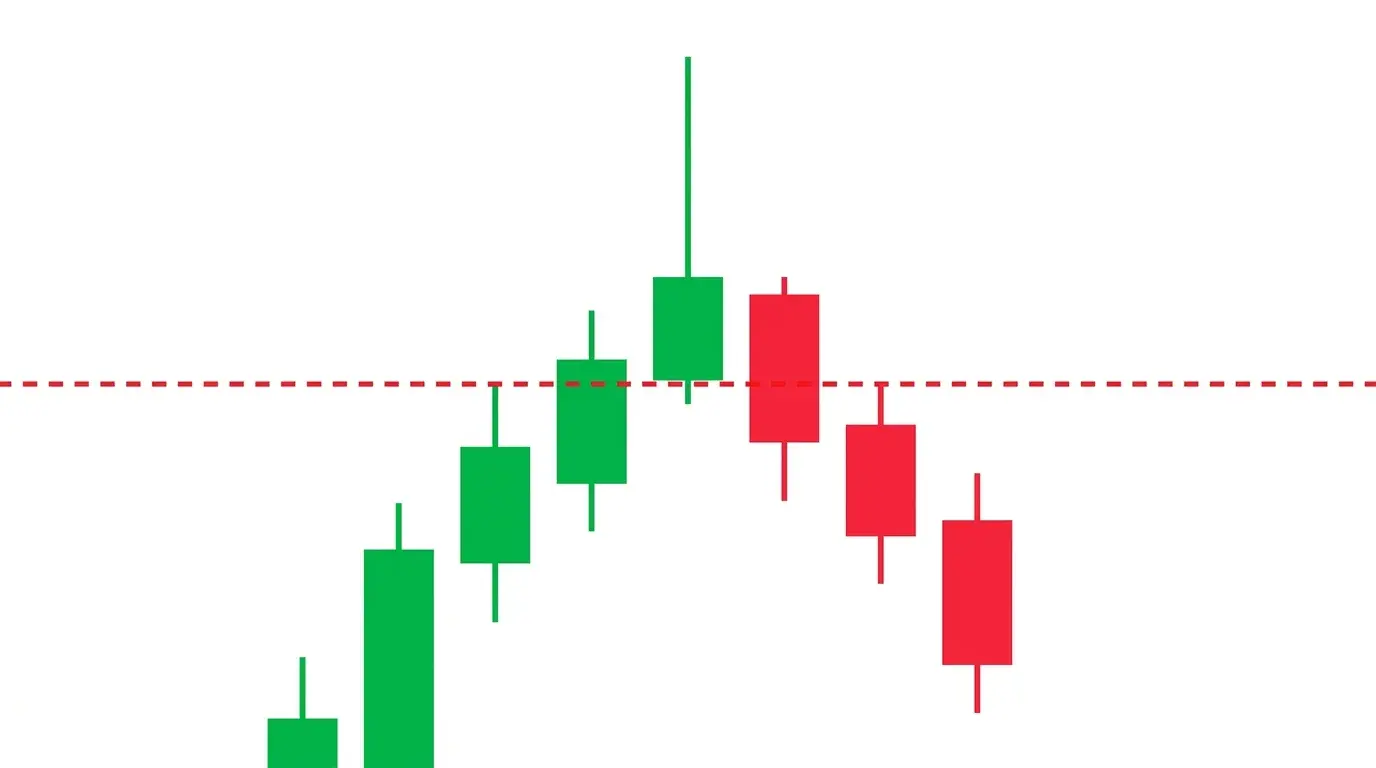
3. Failed Breakout / Trap
Price pushes above a clearly visible resistance level, triggers breakout buy-stops, prints a candle or two beyond the line, and then collapses right back underneath it within the next few bars. That is a failed breakout, sometimes called a bull trap in uptrends or a bear trap in downtrends. It is one of the highest-probability reversal patterns on any chart because it traps real capital on the wrong side of a clear technical level.
The psychology is brutal and clean. Everyone with a breakout strategy enters long when resistance breaks. They place stops back below the level. Price fails to attract follow-through buyers, rolls over, and runs those stops. Now every breakout buyer is liquidating into the same down-move that is already happening, and the resistance line that was support for an hour becomes overhead supply again. Each trapped long is fresh ammunition for the reversal.
The false positive: a momentary dip below a level during a legitimate breakout consolidation. Real breakouts often retest. The confirmation rule is the close, not the wick — if price closes back inside the prior range on the same or next bar after breaking out, you have a failed breakout. If it closes above the level and only the wicks go below, it is still a valid breakout with a retest. Closes beat wicks every time.
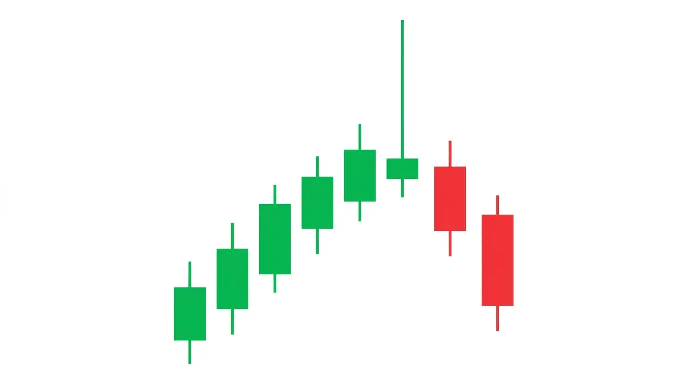
4. Exhaustion Candle (Pin Bar)
A single candle prints with a tiny body and a wick at least two to three times longer than the body, pointing in the direction of the prevailing trend. At the top of an uptrend, the wick sticks up; at the bottom of a downtrend, the wick sticks down. That is a pin bar or shooting star, and it is one of the most visually obvious reversal signals on the chart — the market tried to extend, got rejected hard, and closed roughly back where it started.
The psychology is a compressed version of the climax bar. Within a single session, aggressive buyers pushed to a new high, found no willing sellers at first, then got dumped on by a larger player. By the time the candle closes, the entire intraday advance has been unwound. Everyone who bought inside that wick is now underwater, and their stops sit right below the candle's low. That pool of stops becomes the fuel for the next leg down.
The false positive: pin bars inside a range or during low-volume consolidation are meaningless. A pin bar only counts at the edge of an extended move or at a major level. The confirmation rule is location plus follow-through — the wick should tag a meaningful level (swing high, supply zone, round number) and the next candle should fail to take out the wick extreme. If the next bar makes a new high above the pin wick, the rejection was not real.
5. Liquidity Grab Above Equal Highs
The chart prints two or more highs at roughly the same price — a double top, a cluster of equal highs, an obvious horizontal resistance. Every retail stop-loss and pending sell order sits right above that level. Price finally pokes above the cluster by a handful of pips, sweeps the stops, and immediately reverses back inside the range. That is a liquidity grab, and it is the signature move of smart money engineering a reversal from a visible stop pool.
The psychology is the whole point. Large institutional fills cannot happen in thin air — they need counterparty liquidity, and the densest pools of liquidity sit right above equal highs (where retail shorts are stopped out) and right below equal lows (where retail longs are stopped out). A desk that wants to sell size pushes price up through the equal highs first, uses the stop-out market buys as their exit liquidity, and then lets the position unwind naturally.
The false positive: a legitimate breakout through equal highs that turns into a trend continuation. The confirmation rule is the speed of the reversal — genuine liquidity grabs reverse within one to three candles of taking the stops. If price stays above the equal highs for more than a few bars and starts building a base there, it was a real breakout. For the full framework, see our smart money concepts guide.

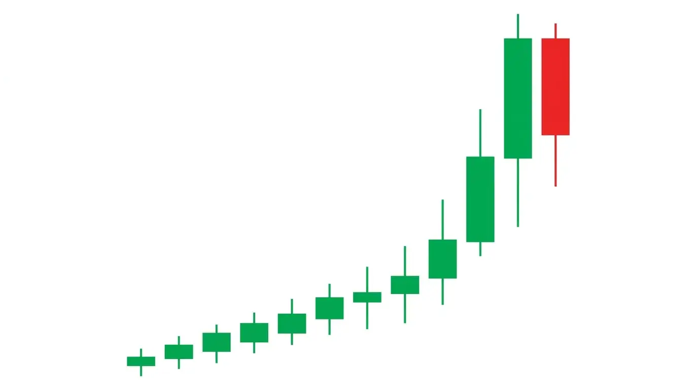
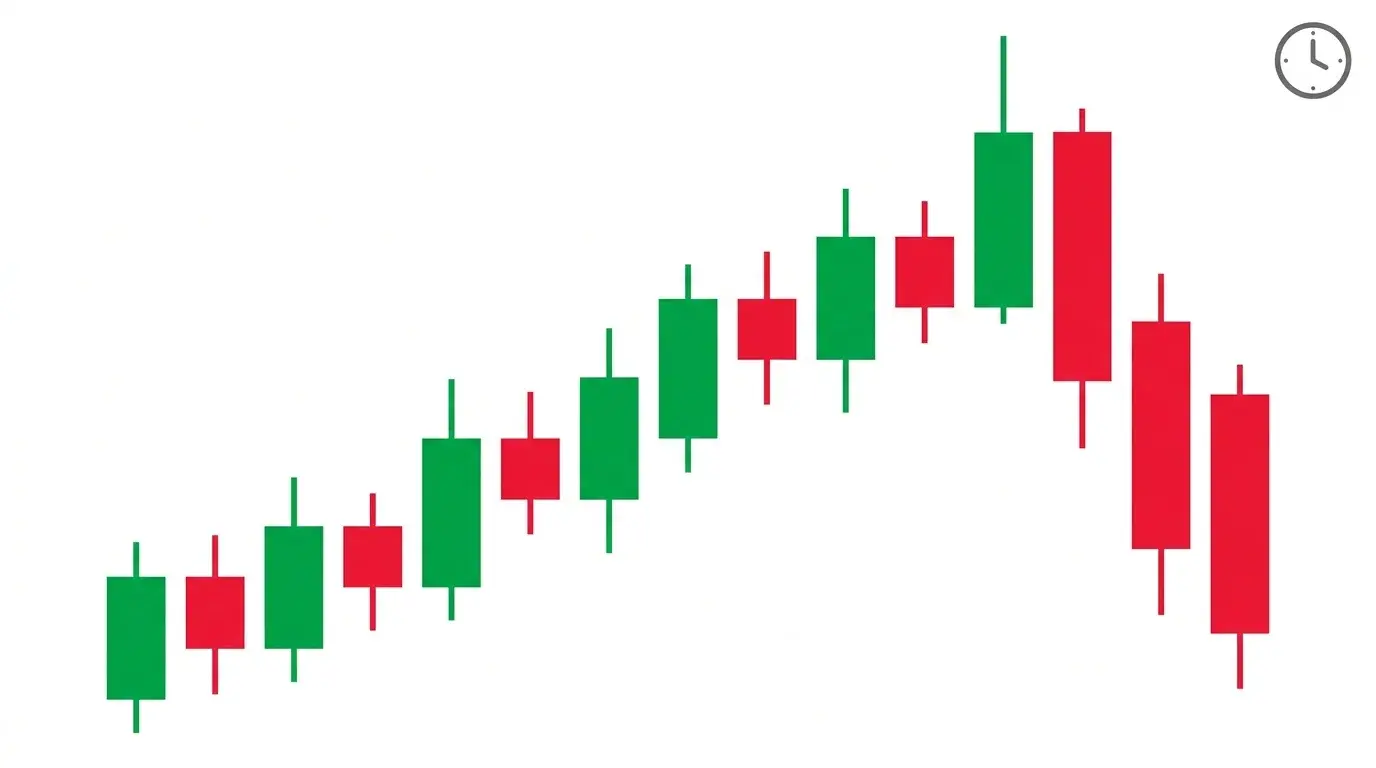
6. Parabolic Blow-Off
The chart detaches from its moving averages and starts making near-vertical progress. Daily ranges double, then triple. Every dip gets bought within hours. The asset makes the front page of mainstream news. Mom texts asking if she should buy some. That is a parabolic blow-off, and it is the single clearest sign that a trend is entering its terminal phase. Parabolas always end — the only question is how much further they go before they do.
The psychology is pure reflexivity. Rising prices attract buyers, which raises prices, which attracts more buyers, which pulls in the latest and weakest hands. By the time the trend is vertical, the only marginal buyer left is the one who heard about it from a taxi driver. When that source of demand dries up — and it always does — the structure collapses because there is nobody underneath to catch it. The unwind is almost always faster than the climb.
The false positive: parabolic moves that consolidate sideways for weeks before resuming. Not every vertical chart tops immediately. The confirmation rule is the first break of the acceleration trendline — draw a line along the steepest phase of the move and wait for a decisive close below it. Early exits cost you upside but spare you the 30% overnight gap down that inevitably arrives when the parabola snaps. Shorting parabolas on the way up is a fast path to the poorhouse; shorting them after the acceleration trendline breaks is one of the cleanest setups in trading.
7. News-Day Capitulation
A major bullish (or bearish) headline drops and the market moves hard in that direction for 15 to 30 minutes — and then completely reverses by the session close. The price action perfectly matches the headline, but the chart ends up finishing on the opposite side. That is news-day capitulation, and it is one of the most reliable signs that a trend is exhausted. The catalyst that should have extended the move failed to attract any follow-through, which means the story is already priced in.
The psychology is the essence of "buy the rumour, sell the news." Every positional trader who was going to buy a bullish CPI beat has already bought in the weeks leading up to it. When the actual print confirms the thesis, there is nobody new to step in at the elevated price. The rally lasts only as long as the algorithmic initial reaction before selling from existing longs taking profit overwhelms it. Hours later the chart is red on green news, and the reversal is often a multi-day swing.
The false positive: an initial fakeout followed by a delayed real rally into the close. Sometimes the market digests news slowly. The confirmation rule is the daily close — if the session closes in the opposite direction of the headline (red close on bullish news, green close on bearish news), the capitulation is real. That close is the signal. Until it prints, treat the reversal as provisional. The bigger the conflict between headline and close, the stronger the reversal signal.
8. Sentiment Flip / Crowd Consensus
Every financial Twitter account, every Discord, every newsletter starts saying the same thing about the same asset. Headlines shift from cautious to celebratory. Magazine covers showing bulls (or bears). Retail positioning data hits extremes on one side. That is a sentiment flip, and it is the classic contrarian reversal signal — when the crowd reaches full consensus, the trade has usually been made. There is nobody left to convert.
The psychology comes down to marginal buyers and sellers. A trend continues as long as new participants can be pulled in at higher prices (or flushed out at lower prices in a downtrend). When sentiment data shows 85%+ of retail long, the pool of potential new buyers is already swimming in the pool. Institutions who need to distribute into retail strength get their best execution here, and the natural second-derivative of sentiment — the rate at which new bulls are arriving — quietly rolls over weeks before price does.
The false positive: strong secular trends can stay at extreme sentiment readings for months. Bitcoin in late-stage bull runs spends weeks at maximum greed. The confirmation rule is to use sentiment as a filter, not a trigger — it tells you the reversal is possible, but you still need one of the first six price-based signals on this list (divergence, climax, failed breakout, exhaustion bar, liquidity grab, parabolic break) to actually enter. Sentiment is the weather forecast; price action is the storm.
9. VIX / Volatility Spike
The VIX (or the equivalent implied volatility index for your asset class) spikes from a compressed reading up through 25, 30, or higher in a matter of sessions. Equity markets sell off into the spike. Every risk asset — crypto, high-beta tech, junk bonds — sells in sympathy. That terminal panic read on the VIX has marked the exact low of almost every equity correction of the past decade. Fear peaks when prices trough, not before.
The psychology is the option market pricing in crash risk that then fails to materialise. Institutions buy protective puts aggressively, which drives implied volatility higher. When the VIX prints a fresh high and the market does not follow through lower, option dealers start delta-hedging their short-put exposure — which means buying the underlying. Peak VIX is almost always synonymous with peak put-buying, which mechanically flips the dealers from short-gamma to long-gamma and turns volatility into a reversal accelerant.
The false positive: the first VIX spike in a bear market almost always reverses, but subsequent spikes can extend much further. 2008 and March 2020 saw VIX climb to 80+ with the market still falling. The confirmation rule is to wait for the VIX to print a lower high while the underlying makes a lower low — that is a volatility divergence, the mirror image of price divergence. When panic stops getting more panicked, the selling is done.
10. DXY Inversion vs Correlated Asset
The asset you are watching — gold, Bitcoin, EUR/USD, the S&P 500, an EM currency — is trending up while the US Dollar Index is also trending up. That should not be possible. These pairs are structurally inverse. When both are rising (or both falling) at the same time, one of them is about to reverse. The DXY and its correlated assets cannot both keep going forever; whichever is moving against its deeper macro anchor is the one that breaks.
The psychology is about forced rebalancing. A rising DXY makes every dollar-denominated asset structurally cheaper for non-US buyers — except the asset is not getting cheaper, it is rising. That arbitrage does not last. Either the asset reverses down to re-establish the inverse, or the DXY reverses down to preserve the rally. Cross-currents like this often resolve inside a single session when a major catalyst hits. The correlated pair is the tell; the actual chart just follows.
The false positive: regime changes where the traditional correlation breaks genuinely. During the 2022 dollar bull run, gold and DXY rose together for months because both were being bid as safe havens. The confirmation rule is to check the historical correlation over the last 60 sessions — if it has been reliably inverse and is now positive, the signal is real; if the correlation has already broken structurally, you are just watching two assets that no longer relate. See our currency strength meter guide for how we track this in real time.
11. Cross-Asset Divergence
The S&P 500 is ripping to new highs but the Russell 2000 (small caps) is stuck in a range. Bitcoin is pressing higher but the major altcoins are flat. USD/JPY is climbing but 10-year yields are not. That is cross-asset divergence — one asset making new extremes while its natural partner fails to confirm. It is the most senior version of divergence on this list and often leads a regime change by weeks.
The psychology is about breadth. A healthy trend is broad — it lifts correlated names, sectors, risk currencies, cyclicals, yields. When only the headline index is making new highs and everything else is lagging, the move is being carried by a narrow cohort of capital. That narrow leadership is fragile because it only takes a few large holders rotating out to end the trend entirely. Broad moves have a thousand buyers behind them; narrow moves have a handful.
The false positive: thematic regimes where one sector genuinely dominates. The AI rally of 2023 saw the Nasdaq make new highs while the rest of the index lagged, and it kept going for another year. The confirmation rule is to add a time dimension — cross-asset divergence matters when it persists across multiple weeks and starts widening rather than narrowing. If the lagging asset is catching up, the divergence is closing. If it is falling further behind, the reversal is building. Check the spread, not just the levels.
12. End-of-Session Fade
An asset trends cleanly all day and then, in the final 30 to 60 minutes before the session close, the move reverses sharply. The candle that was going to close green finishes red, or vice versa. The 5pm ET forex close, the 4pm ET equity close, and the 24h daily candle close on crypto are all moments where this pattern shows up. Institutional flow often concentrates at the close for settlement reasons, and when that flow goes against the day's trend, it signals positioning has tipped.
The psychology is about mark-to-market and daily P&L. Many institutional books rebalance into the close to match an index, to neutralise risk for overnight, or to lock in a printed level for month-end and quarter-end reporting. When the closing flow systematically fades a strong intraday trend — three or four sessions in a row — it is a strong signal that real money is using the intraday strength to exit. The next morning often opens in the direction of the closing fades rather than the daytime trend.
The false positive: a single end-of-day fade on a low-volume holiday session or around a settlement that is not relevant to your asset. One session of closing weakness is noise. The confirmation rule is to count sessions — three or more consecutive closes where the final hour fades the intraday trend is a genuine positioning signal. One or two can be random. This one pairs especially well with sentiment flips (sign 8) and cross-asset divergence (sign 11) because all three are slow-burn signals that the marginal buyer is walking away.
The Bottom Line
Reversal trading is a game of cluster recognition, not single-signal prediction. Any one of the twelve signs above can be gamed, faked, or delayed. Two of them together start to matter. Three or four stacked inside the same session on the same asset is where real edge lives. The RSI divergence warns you. The failed breakout gives you the trigger. The volume climax confirms the exhaustion. The cross-asset divergence tells you the regime is turning underneath all of it.
The traders who lose money on reversals are the ones who see one sign and immediately fight the trend. The traders who make money are the ones who wait patiently for the stack to appear and enter when the odds are finally on their side. Every trend ends — but not when you want it to, and not on any single signal. Build the checklist. Wait for the cluster. Then act.
If you want to see these signals ranked and flagged across 32 live instruments every day — forex, gold, Bitcoin, the S&P 500 and US tech — that is exactly what the ChartSnipe AI News Impact dashboard was built for. It combines live prices, currency strength, and AI-ranked top pairs so you can spot the cluster before it fully forms.
Related Articles
Bull Trap & Bear Trap Patterns
How smart money engineers false breakouts and how to avoid getting trapped on the wrong side.
Bearish Reversal Candlestick Patterns
Twelve bearish reversal candles including evening star, shooting star, and bearish engulfing — how to spot the top.
Smart Money Concepts: Order Blocks & Liquidity
Order blocks, market structure breaks, and liquidity pools — how institutions actually move markets.
Written by the ChartSnipe Team
ChartSnipe is an AI-powered chart screenshot analysis tool and daily AI news impact analysis platform for forex, gold, Bitcoin, S&P 500, and Nasdaq traders. Our team combines deep experience in technical analysis, AI vision models, and live market data across 32+ instruments to deliver actionable reversal and continuation signals.
Spot the reversal cluster before the crowd does
Daily AI news impact analysis across 32 instruments — live prices, currency strength, and AI-ranked top bullish and bearish pairs. Updated every trading session.
Open News Impact Dashboard