Breakout Chart Patterns: Flags, Pennants & Wedges
A professional trader's guide to 12 continuation and breakout patterns with entry triggers, measured move targets, and volume confirmation.
Breakout trading is one of the most consistent ways to capture large directional moves in any market. The premise is straightforward: price consolidates, energy builds, and when the pattern resolves, a powerful move follows. The difficulty lies in knowing which patterns to trust, when to enter, and where to set your target.
This guide covers 12 breakout and continuation chart patterns that professional traders rely on every day. Each pattern includes a visual example, formation characteristics, signal interpretation, and a concrete trading plan with entry, stop loss, and measured move target. Whether you trade forex, stocks, crypto, or commodities, these patterns appear across all instruments and timeframes.
If you are also studying reversal setups, pair this guide with our bullish reversal candlestick patterns and double top, double bottom, and head and shoulders patterns guides. Combining continuation and reversal knowledge gives you a complete pattern recognition toolkit.
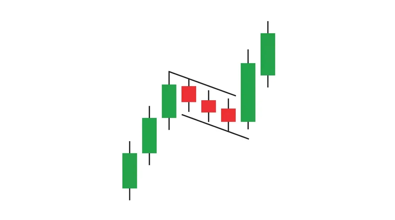
1. Bullish Flag Pattern
What It Looks Like
The bullish flag begins with a sharp, near-vertical rally called the flagpole. Price then drifts lower within two parallel downward-sloping trendlines, forming the flag portion. Volume contracts steadily during the consolidation phase, signaling that sellers are not committed and the pullback is corrective rather than distributive. The entire flag typically retraces between 25% and 50% of the flagpole before resolving.
What It Signals
A bullish flag is a continuation pattern that signals the prevailing uptrend is pausing to digest gains before resuming. It reflects healthy profit-taking after an aggressive move. The declining volume during the flag tells you institutions are holding their positions, not liquidating them. When the pattern completes, the next leg up often matches or exceeds the original flagpole in magnitude.
How to Trade It
Enter on a candle close above the upper trendline of the flag, not on a mere wick through it. Volume on the breakout candle should be at least 1.5 times the 20-period average to confirm genuine buying interest. Set your stop loss below the lowest point of the flag, and calculate your measured move target by projecting the flagpole length from the breakout point upward. Many professional traders scale out in thirds: one-third at 50% of the target, one-third at the full measured move, and the final third with a trailing stop.
2. Bearish Flag Pattern
What It Looks Like
The bearish flag is the mirror image of its bullish counterpart. A steep, impulsive sell-off forms the flagpole, followed by a shallow upward-sloping consolidation channel. The flag drifts higher on diminishing volume as short-covering and minor buying activity create the counter-trend movement. The pattern typically completes within one to three weeks on a daily chart, though it scales to any timeframe.
What It Signals
This continuation pattern tells you the downtrend is intact and the upward drift is nothing more than a relief rally. Sellers are regrouping, not retreating. The declining volume during the flag confirms that buyers lack conviction to push price materially higher. Once the lower boundary of the flag breaks, the next wave of selling pressure typically accelerates price toward the measured move target.
How to Trade It
Wait for a candle close below the lower trendline of the flag to trigger your short entry. Aggressive traders sometimes enter on a break of the midpoint of the flag channel, but the conservative approach requires a clean break of the lower boundary. Place your stop loss above the highest point of the flag and target a measured move equal to the flagpole length projected downward from the breakout. Volume expansion on the breakdown candle confirms institutional selling is driving the move.
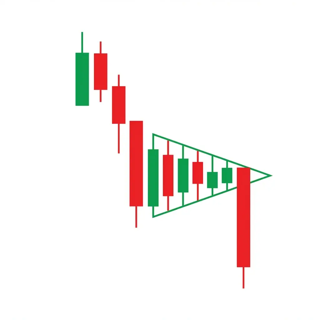
3. Bullish Pennant Pattern
What It Looks Like
The bullish pennant shares the same impulsive flagpole rally as the bullish flag, but the consolidation phase is distinctly different. Instead of parallel lines, the highs and lows converge into a small symmetrical triangle. Each successive swing high is lower and each successive swing low is higher, compressing price into an increasingly narrow range. Volume dries up progressively as the apex approaches, building potential energy for the breakout.
What It Signals
The converging lines of a bullish pennant represent equilibrium between buyers and sellers, but within the context of a strong prior uptrend. This temporary balance is unstable and almost always resolves in the direction of the prevailing trend. The tightening range tells you that selling pressure is diminishing with each wave, and buyers are willing to step in at progressively higher levels. Pennants tend to resolve faster than flags, often within five to fifteen candles.
How to Trade It
Enter when price closes above the upper converging trendline with a noticeable volume spike. Because pennants are tight formations, the breakout tends to be explosive, so set a price alert rather than sitting in front of the screen waiting. Your stop loss goes below the last swing low within the pennant. The measured move target is the full flagpole length projected upward from the breakout point. Due to the compressed nature of the pattern, risk-to-reward ratios on pennants are often exceptionally favorable, frequently exceeding 3:1.
4. Bearish Pennant Pattern
What It Looks Like
The bearish pennant forms after a steep decline with converging trendlines creating a small symmetrical triangle. Price action compresses as lower highs and higher lows alternate, with each successive swing losing amplitude. Volume contracts significantly during the consolidation, often dropping to 30-40% of the levels seen during the flagpole sell-off. The pattern looks like a small coil that is about to spring open to the downside.
What It Signals
In a bearish context, the pennant consolidation represents short-sellers locking in profits and new shorts building positions at higher levels. The fact that each bounce attempt fails at a lower price demonstrates that buying demand is insufficient to mount a reversal. When this pattern forms on higher timeframes like the daily or weekly chart, the resulting breakdown can be severe, as the compression period allows a larger number of stop losses to cluster just above the pattern.
How to Trade It
Short on a candle close below the lower converging trendline. Volume should increase on the breakdown candle to confirm genuine selling interest rather than a liquidity grab. Place your stop above the most recent swing high within the pennant. The measured move target is the flagpole distance projected downward from the breakdown point. Be cautious of breakdowns that occur on low volume, as these are prone to reversals. A useful confirmation technique is to wait for a second candle to hold below the breakdown level before committing full position size.
5. Falling Wedge Pattern (Bullish)
What It Looks Like
The falling wedge consists of two downward-sloping trendlines that converge toward each other. Both highs and lows are declining, but the key detail is that the lower trendline drops at a steeper angle than the upper one. This creates a narrowing channel that slopes to the downside. Volume typically decreases throughout the pattern's formation, and the pattern usually takes longer to develop than a flag or pennant, sometimes spanning twenty to fifty candles on any given timeframe.
What It Signals
Despite the downward-sloping appearance, the falling wedge is a bullish pattern. The converging trendlines indicate that selling momentum is weakening with every new low. Sellers are running out of conviction, and buyers are stepping in at progressively shallower pullbacks relative to the lower boundary. This pattern can appear as a continuation during an uptrend or as a reversal at the end of a downtrend. In both cases, the resolution is to the upside.
How to Trade It
Enter on a candle close above the upper trendline of the wedge with a volume surge. The measured move target equals the widest part of the wedge (measured at the beginning of the pattern) projected upward from the breakout point. Place your stop loss below the most recent swing low within the wedge. Falling wedges that break out in the first two-thirds of the pattern (before reaching the apex) tend to produce stronger moves than those that grind all the way to the tip. If price reaches the apex without breaking out, the pattern loses its predictive power.
6. Rising Wedge Pattern (Bearish)
What It Looks Like
The rising wedge is the bearish counterpart to the falling wedge. Two upward-sloping trendlines converge as both highs and lows rise, but the lower trendline rises at a steeper angle than the upper one. This squeezes price into a narrowing ascending channel. The upward drift creates the illusion of strength, which is why this pattern traps so many breakout buyers before reversing. Volume fades throughout the formation, revealing that the apparent uptrend lacks institutional backing.
What It Signals
The rising wedge signals that buying momentum is exhausting itself. Each new high is achieved with less enthusiasm, and the rising lower trendline shows that buyers are becoming increasingly desperate to support price. This pattern is particularly dangerous because it looks bullish on the surface, luring in late buyers who become trapped when the breakdown occurs. It can act as a reversal at a top or a continuation during a downtrend.
How to Trade It
Short on a candle close below the lower trendline of the wedge. The breakdown is often sharp because trapped longs are forced to sell, amplifying the move. Set your stop loss above the most recent swing high within the wedge. The measured move target is the widest part of the wedge projected downward from the breakdown point. A classic confirmation is a retest of the broken lower trendline from below, which acts as new resistance. This retest entry offers a tighter stop and improved risk-to-reward compared to chasing the initial breakdown.
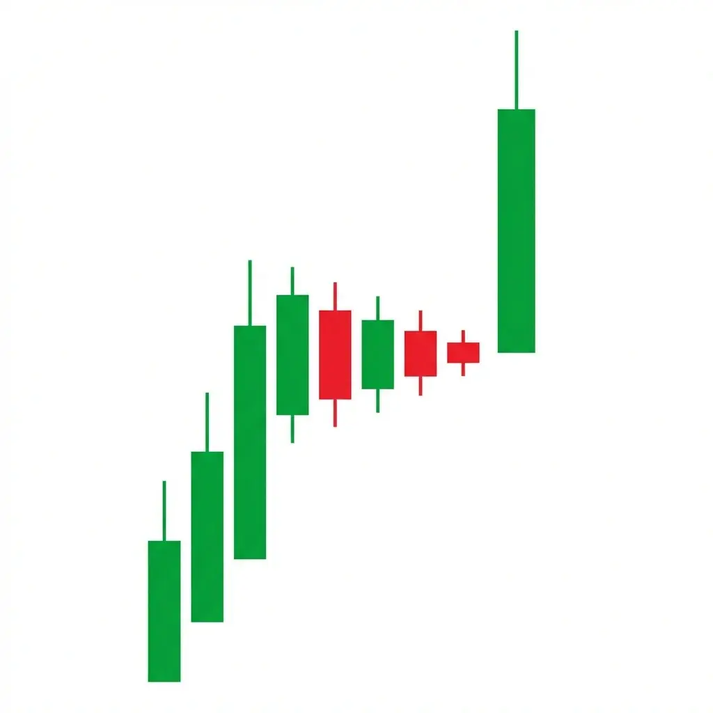
7. High Tight Flag Pattern
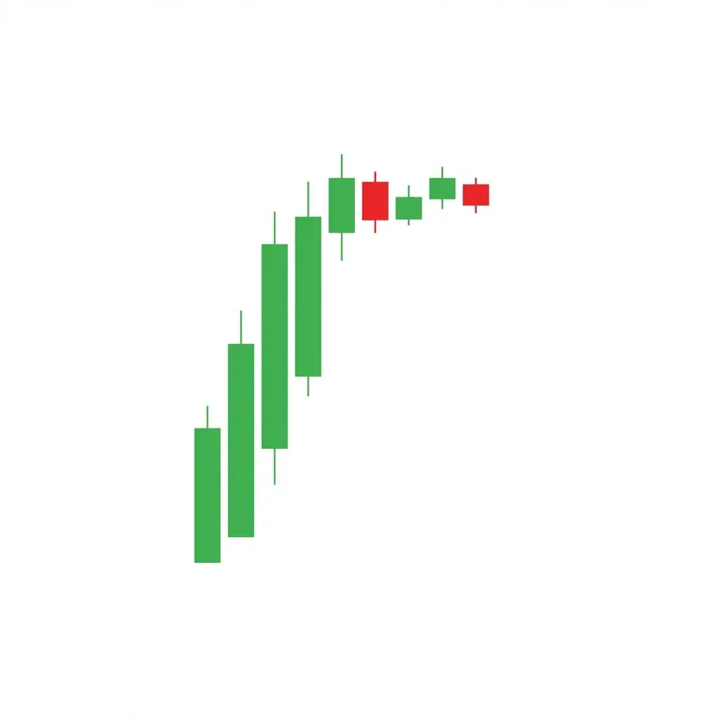
What It Looks Like
The high tight flag is the rarest and most powerful variation of the flag pattern. It begins with an extraordinary rally of 100% or more within a short period, typically four to eight weeks. The consolidation that follows is remarkably shallow, retracing only 10% to 25% of the flagpole. This shallow pullback on low volume indicates that holders are unwilling to sell even after a massive run-up, which is a sign of extreme conviction. The flag portion is tight and compact, often lasting one to three weeks.
What It Signals
The high tight flag is among the most bullish patterns in all of technical analysis. When a stock doubles or more and then barely pulls back, it signals that demand is overwhelming supply at every level. Institutions that missed the initial move are waiting to buy any dip, and existing holders see no reason to sell. William O'Neil identified this as one of the strongest precursors to continued momentum, particularly in growth stocks and crypto assets during major bull markets.
How to Trade It
Enter on a candle close above the high of the flag consolidation range with volume at least double the 20-period average. This pattern demands strong volume confirmation because the measured move target is enormous. Place your stop loss below the lowest point of the flag. Because the flagpole is so large (100%+), the measured move target can imply another doubling from the breakout point. Position sizing is critical here: use a smaller position than normal because the wide stop accommodates the volatility, but let the measured move work in your favor. These setups are rare, so when they appear, they deserve full attention.
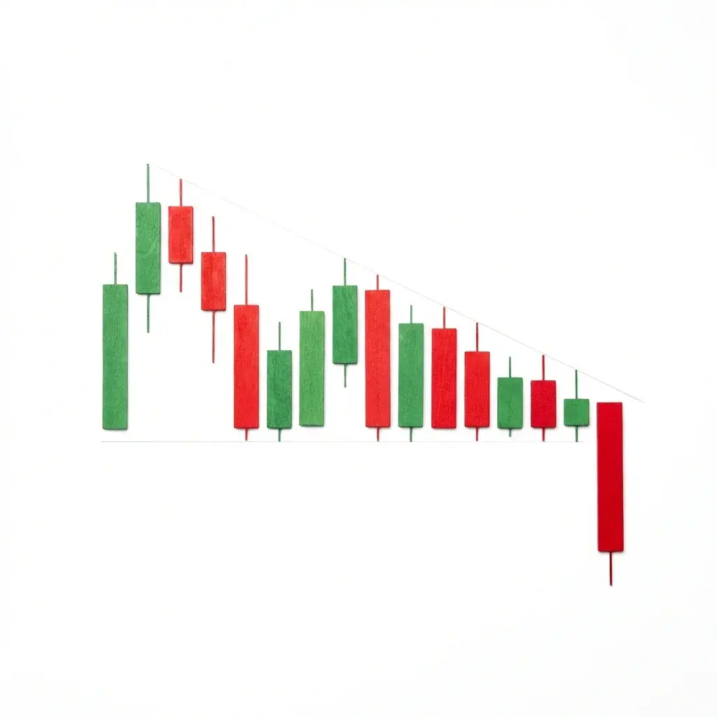
8. Ascending Triangle Pattern
What It Looks Like
The ascending triangle features a flat horizontal resistance level at the top and a rising lower trendline connecting a series of higher lows. Price bounces between these two boundaries, with each bounce off support reaching the same resistance level while the pullbacks become increasingly shallow. The flat resistance acts as a ceiling that sellers defend multiple times, while buyers demonstrate growing urgency by stepping in at progressively higher prices. Volume generally contracts as the pattern matures.
What It Signals
The ascending triangle is a bullish continuation pattern that tells you demand is methodically overwhelming supply at the resistance level. Each test of the ceiling absorbs more sell orders, and the rising lows confirm that buyers are increasingly willing to pay higher prices. When the remaining sell orders at resistance are finally exhausted, price breaks out with conviction. This pattern is particularly reliable when it forms during an established uptrend and on higher timeframes like the 4-hour or daily chart.
How to Trade It
Enter on a candle close above the flat resistance level with above-average volume. The measured move target is the height of the triangle (distance from the flat resistance to the lowest point of the pattern) projected upward from the breakout. Stop loss goes below the most recent higher low within the triangle. A common mistake is entering before the resistance actually breaks. Set an alert at the resistance level and only act when you see a decisive close above it. If the breakout occurs on weak volume, consider waiting for a retest of the broken resistance as new support before entering.
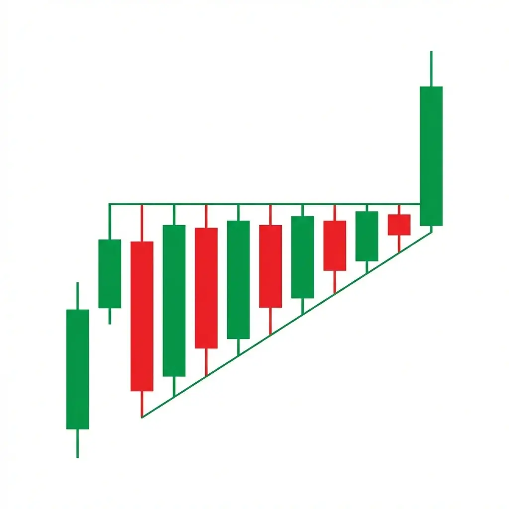
9. Descending Triangle Pattern
What It Looks Like
The descending triangle is the bearish mirror of the ascending triangle. It features a flat horizontal support level at the bottom and a descending upper trendline connecting a series of lower highs. Price repeatedly tests the support floor while each rally fails at a lower price than the previous one. The flat support acts as a floor that buyers defend, but the declining rally highs demonstrate that sellers are applying increasing pressure with each wave. Volume diminishes as the pattern tightens.
What It Signals
The descending triangle signals that supply is systematically overwhelming demand at the support level. Each test of the floor absorbs more buy orders until they are exhausted. The lower highs confirm that sellers are increasingly willing to accept lower prices, showing urgency to exit. When support finally gives way, the resulting breakdown is often sharp because all the buy orders that had been defending that level are consumed, creating a vacuum below. This pattern frequently appears before earnings warnings, credit downgrades, or sector rotation in stocks.
How to Trade It
Short on a candle close below the flat support level with volume expansion. The measured move target is the height of the triangle projected downward from the breakdown point. Place your stop loss above the most recent lower high within the triangle. Be careful of false breakdowns where price wicks below support only to close back inside the pattern. Waiting for a second confirming candle below support, or a retest of the broken support as new resistance, significantly reduces the chance of getting caught in a bear trap.
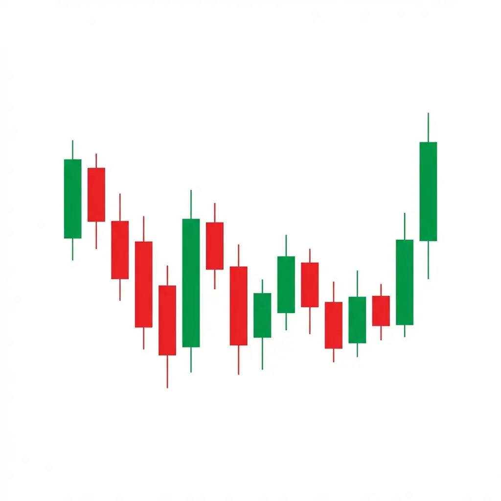
10. Symmetrical Triangle Pattern
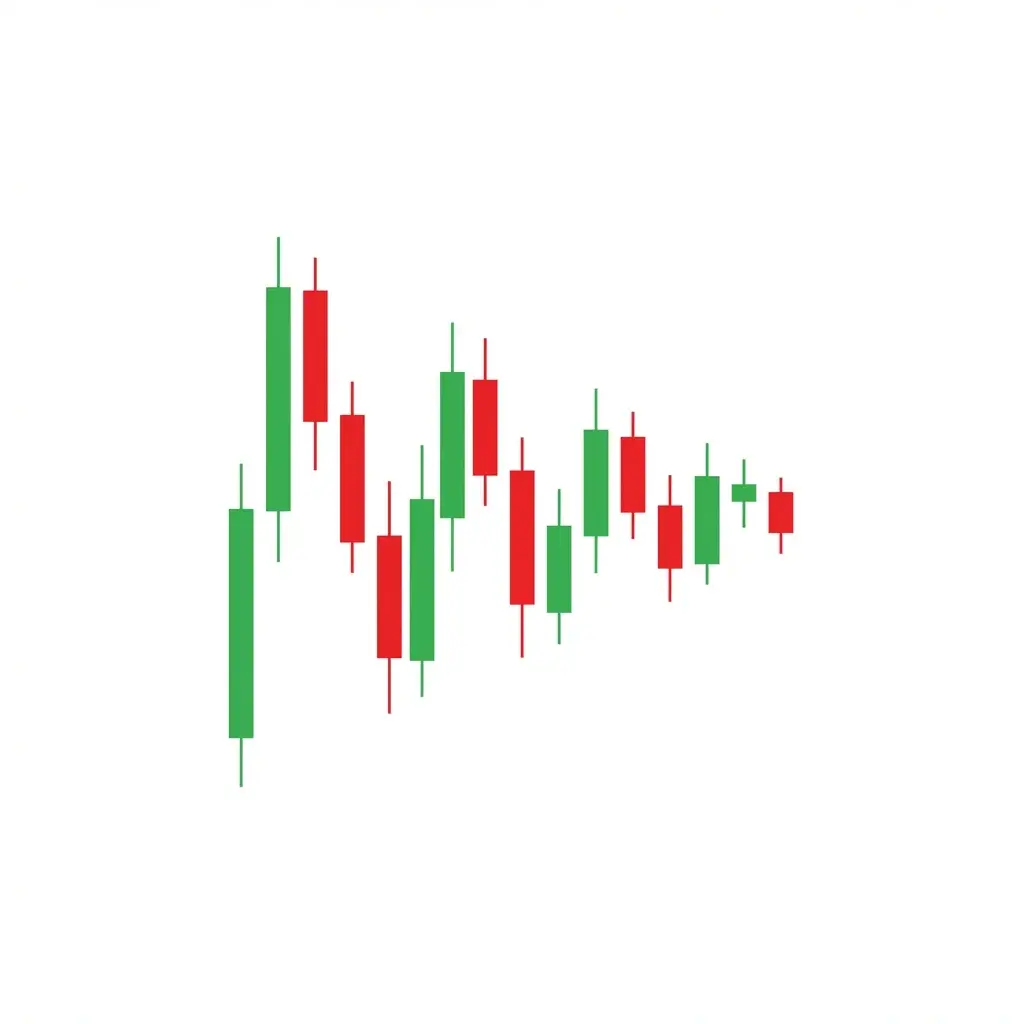
What It Looks Like
The symmetrical triangle consists of two converging trendlines with approximately equal and opposite slopes. The upper trendline connects lower highs while the lower trendline connects higher lows, creating a pattern that narrows to an apex. Unlike the ascending or descending triangle, neither side shows a clear advantage. Volume contracts progressively as the triangle tightens, often reaching its lowest point just before the breakout. The pattern typically contains at least four alternating touches of the upper and lower trendlines.
What It Signals
The symmetrical triangle is a neutral pattern that represents genuine indecision between buyers and sellers. The direction of the breakout determines the trade. Statistically, symmetrical triangles tend to resolve in the direction of the preceding trend, making them slight continuation patterns. However, do not anticipate the direction. Let the market show you which side wins. The energy stored during the compression phase is released in a single directional burst, and the first few candles after the breakout usually define the trend for the next swing.
How to Trade It
Place alerts on both trendlines and trade in the direction of the breakout. Enter on a candle close beyond either trendline with volume confirmation. If the breakout is upward, stop loss goes below the last swing low within the triangle. If downward, stop loss above the last swing high. The measured move target is the height of the triangle at its widest point, projected from the breakout level. Breakouts that occur in the first two-thirds of the triangle (before the apex) tend to produce more reliable moves. Breakouts near the apex are weaker and more prone to failure.
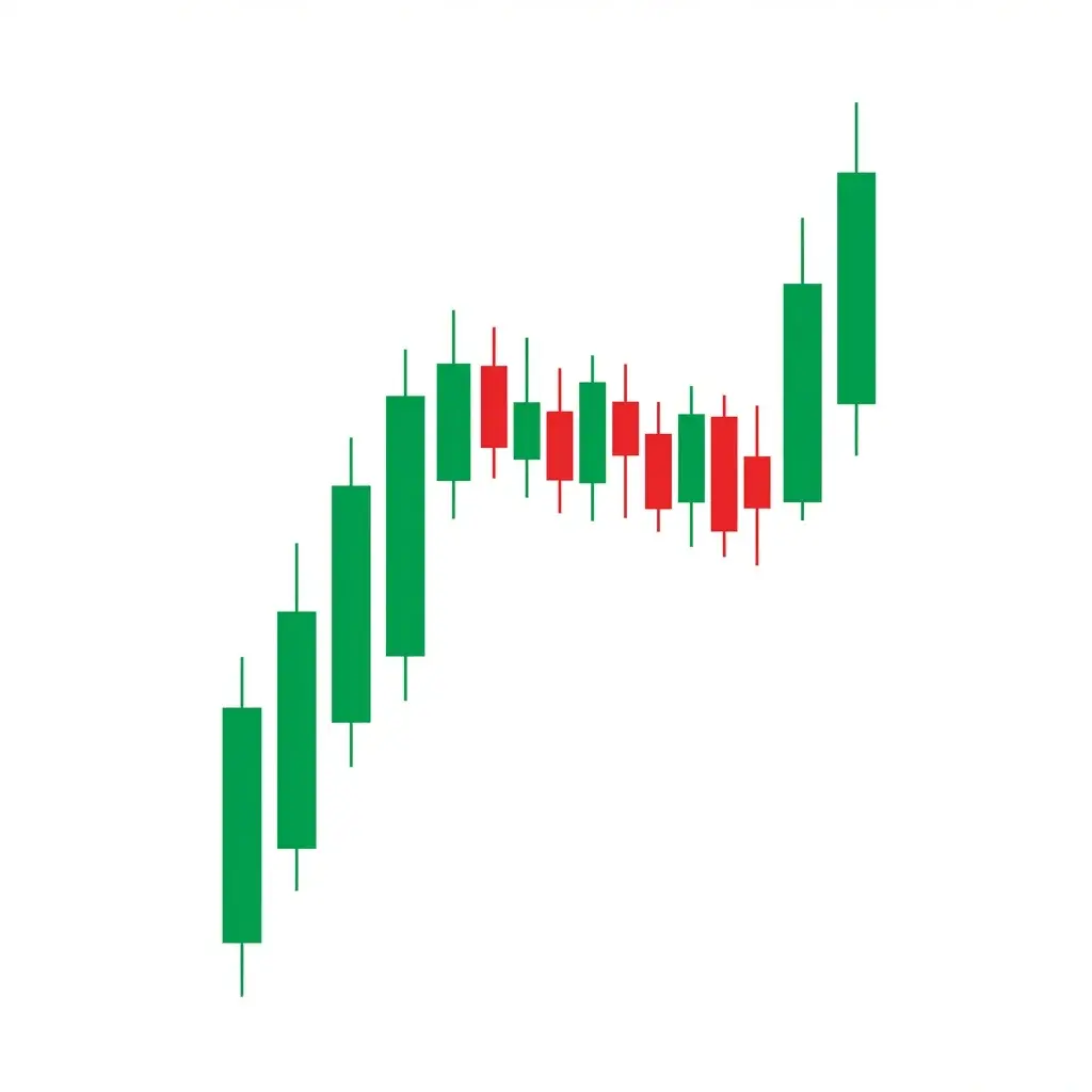
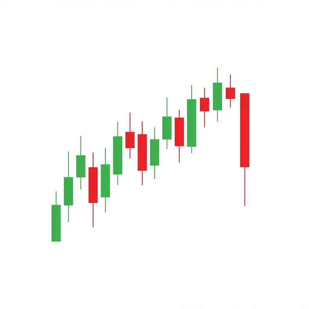
11. Rectangle Breakout Pattern
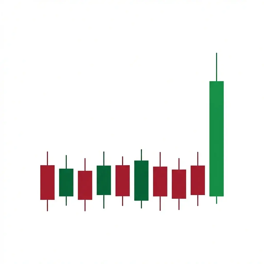
What It Looks Like
The rectangle breakout is the simplest consolidation pattern to identify. Price oscillates between a clearly defined horizontal resistance and horizontal support, creating a box or range. The more times price tests both boundaries without breaking through, the more significant the eventual breakout becomes. Volume often follows a cyclical pattern within the rectangle, expanding on approaches to the boundaries and contracting in the middle of the range. The rectangle can persist for weeks or even months on a daily chart.
What It Signals
A bullish rectangle breakout signals that buyers have finally absorbed all the selling pressure at resistance. During the consolidation, institutions accumulate positions within the range, using resistance sell-offs as opportunities to build positions quietly. When supply at resistance is exhausted, price explodes upward. The longer the rectangle persists and the more times resistance is tested, the more powerful the breakout, because more sell orders have been consumed during the consolidation period.
How to Trade It
Enter on a candle close above horizontal resistance with volume at least 1.5 times the 20-period average. The measured move target is the height of the rectangle projected upward from the resistance level. Stop loss goes below the midpoint of the rectangle, not all the way to support, as a close back into the middle of the range invalidates the breakout thesis. Range traders should watch for a shift from range-bound behavior to trending behavior: the first candle that closes above resistance with strong volume is your signal to switch from selling resistance to buying the breakout.
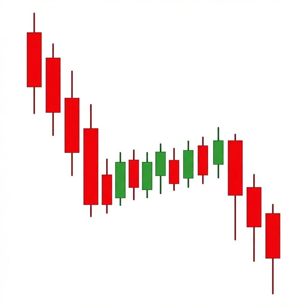
12. Rectangle Breakdown Pattern
What It Looks Like
The rectangle breakdown uses the same horizontal support and resistance structure as the bullish rectangle, but the resolution is to the downside. Price oscillates within the range until it breaks below horizontal support with volume expansion. A subtle clue that a breakdown is coming rather than a breakout is when the bounces off support become weaker over time, with price failing to reach resistance on the later tests. This diminishing upside momentum within the range suggests distribution is occurring.
What It Signals
A bearish rectangle breakdown signals that buyers defending support have been overwhelmed. During the consolidation, institutions distribute their positions by selling into each rally toward resistance. When the buying interest at support is finally consumed, the floor gives way. The resulting sell-off can be aggressive because all the traders who bought at support during the consolidation are now trapped with losses, and their stop-loss orders fuel additional selling pressure below the broken support level.
How to Trade It
Short on a candle close below horizontal support with a volume surge. The measured move target is the height of the rectangle projected downward from the support level. Place your stop loss above the midpoint of the rectangle. An advanced technique is to monitor order flow within the range: if you notice that rallies off support are producing smaller and smaller bounces while still reaching support with the same intensity, the breakdown is approaching. Waiting for a retest of broken support as new resistance provides a higher-probability entry with a tighter stop loss.
How to Confirm a Real Breakout
Knowing the patterns is only half the battle. The other half is distinguishing real breakouts from the false ones that trap traders and trigger stop losses. Here are the three pillars of breakout confirmation that every trader should apply before committing capital.
Volume Confirmation
Volume is the single most important confirmation tool for breakout trading. A genuine breakout should produce volume that is at least 1.5 to 2 times the 20-period average. This surge in participation tells you that institutions are driving the move, not just retail traders chasing price. Volume should expand on the breakout candle itself, not in the candles leading up to it. If the breakout candle has below-average or average volume, treat it with extreme suspicion. Many false breakouts occur on thin volume during off-peak hours, so prefer breakouts that happen during the main trading session for your instrument.
The Retest
After a genuine breakout, price often pulls back to retest the broken level. Former resistance becomes support on a bullish breakout, and former support becomes resistance on a bearish breakdown. This retest is one of the most powerful confirmation signals because it proves the level has truly flipped. Not every breakout produces a retest, so do not make it mandatory for every trade. However, when a retest does occur, it offers a second-chance entry with a tighter stop loss and improved risk-to-reward. The retest should hold on lower volume than the breakout candle, indicating that the pullback is corrective.
Timeframe Alignment
Breakouts on higher timeframes are significantly more reliable than those on lower timeframes. A bullish flag breakout on the daily chart carries far more weight than the same pattern on the 5-minute chart. The reason is simple: higher timeframes filter out noise and represent the decisions of larger participants. For the highest probability trades, look for patterns forming on the 4-hour or daily chart. If you trade lower timeframes, use the higher timeframe to determine direction and the lower timeframe to fine-tune your entry. A breakout that aligns with the trend on multiple timeframes has the strongest odds of following through.
Pro tip: Never chase a breakout that has already moved significantly beyond the pattern boundary. If you missed the initial entry, wait for a retest or move on to the next setup. There will always be another pattern. Chasing leads to poor entries, wide stops, and blown risk-to-reward ratios.
Frequently Asked Questions
What is the most reliable breakout chart pattern?
The bull flag is widely considered the most reliable breakout pattern because it forms after a strong impulsive move, consolidates on declining volume, and breaks out in the direction of the prevailing trend. When confirmed with above-average volume on the breakout candle, bull flags have a high completion rate across all timeframes and asset classes.
How do you confirm a real breakout vs a false breakout?
Confirm a real breakout by checking three factors: volume should spike to at least 1.5x the 20-period average on the breakout candle, the candle should close decisively beyond the pattern boundary rather than just wicking through, and a successful retest of the breakout level as new support or resistance adds further confirmation. Trading on higher timeframes like the 4-hour or daily chart also reduces false breakout frequency.
What is the difference between a flag and a pennant pattern?
A flag pattern consolidates within parallel trendlines that slope against the prior trend, forming a rectangular channel. A pennant pattern consolidates within converging trendlines, forming a small symmetrical triangle. Both are continuation patterns that follow a strong impulsive move, but pennants typically resolve faster because the converging lines compress price into a tighter range that forces a breakout sooner.
Is a falling wedge bullish or bearish?
A falling wedge is a bullish pattern. Despite the downward slope, the converging trendlines show that selling pressure is weakening as the pattern develops. When price breaks above the upper trendline with volume confirmation, it signals the start of a bullish reversal or continuation. The measured move target is the height of the widest part of the wedge projected from the breakout point.
How do you calculate the price target for a breakout pattern?
The standard method is the measured move technique. For flag and pennant patterns, measure the length of the flagpole (the impulsive move before consolidation) and project that distance from the breakout point. For triangles and wedges, measure the height of the pattern at its widest point and project that distance from the breakout level. These targets are guidelines, not guarantees, so many traders take partial profits at 50% and 100% of the measured move.
Real talk - most blown accounts from breakout trading come from entering too early. Set your alerts, go do something else, and come back when it actually breaks. The chart doesn't care if you're watching or not.
Still drawing trendlines by hand?
ChartSnipe scans for flags, wedges, triangles and 50+ other patterns automatically. Just upload your chart.
Try it outMore on chart patterns: Double Tops & H&S · Bullish Reversals